Background
The year of 2020 was dominated by the news of how COVID-19 spread around the world, and how life has been changed by the disruption of this pandemic. We have witnessed the journeys of battling the disease, dedication and sacrifices by the front-line heroes, and the emotional roller coaster of wondering when this pandemic would end, or when we’d have vaccines that safely protect us from the unprecedented pandemic.
The UK government authorized the first vaccine use for Pfizer-BioNTech COVID-19 Vaccine on Dec 2, 2020,1 and following that, the FDA issued an Emergency Use Authorization (EUA) for the use of the vaccine in the United States on December 11, 2020.2 Since then, governments and health organizations across the globe have focused on ending the pandemic through vaccine distribution.
Despite this effort, we continue to face various blocks for vaccine distribution. Initially, due to limited supply, certain groups of individuals were prioritized; states in the US gradually began mass vaccination in late March, with all US adults eligible for the vaccine in late April. Although the Biden administration has been pushing very hard to end this pandemic by providing easy, fast and streamlined access to vaccines, various factors play into the result of getting vaccinated or not: education, income, occupation, religious beliefs, politics, geographies, and many other socio-economic determinants.
With 100% access to CMS’ Medicare claims dataset, CareJourney did an exploratory analysis on relevant claims to understand COVID-19 vaccination coverage. We want to answer the following questions:
- Who is getting vaccinated?
- Where are people getting vaccinated? By whom?
- How does vaccine penetration vary in different geographies?
- What is the vaccine volume breakdown for Medicare Advantage payers?
Methodology and Data Considerations
We collected all relevant claims from December 2020 to August 2021 (the most recent month as of when this blog was written) by selecting HCPCS codes for COVID-19 vaccines as below:
- 0001A: Pfizer-BioNTech Covid-19 Vaccine Administration – First Dose
- 0002A: Pfizer-BioNTech Covid-19 Vaccine Administration – Second Dose
- 0011A: Moderna Covid-19 Vaccine Administration – First Dose
- 0012A: Moderna Covid-19 Vaccine Administration – Second Dose
- 0031A: Janssen (Johnson & Johnson) Covid-19 Vaccine Administration
When pulling out those relevant claims, we also extracted the first vaccination date and the second date (if it exists) for each beneficiary, and the vaccine brand associated with each date. In theory, a fully vaccinated beneficiary should have HCPCS codes that refer to only one brand, and each corresponds to “first dose” and “second dose”.
There are cases where the first/second dose HCPCS code appears twice for some beneficiaries. With the current data access, it would not be possible to determine the cause of the data hygiene issue. However, as the first dose and second dose of the Pfizer or Moderna COVID-19 vaccine should be exactly the same, both chemically and from a dosage standpoint,3 we consider such beneficiaries to be fully vaccinated, and assign the dates chronologically to be the first shot date and the second shot date.
After cleaning the data, we linked those vaccine records with the annual enrollment information from CMS to count the total number of fully/partially vaccinated, and the remaining considered to be part of the no vaccine claims group.
It can be noted that the overall vaccination rate is relatively low compared to the national vaccination rate, and we think this could be due to the reasons below:
- Many people may walk into vaccination sites without registering insurance information, as the vaccine is free regardless of insurance status. For reference, HRSA (Health Resources and Services Administration) announces that it has paid over 5 million claims to health care providers for administering COVID-19 vaccines to uninsured individuals.4 Some of those claims could have been people who did not register insurance information when receiving COVID-19 vaccines. As a result, although shots are given, such records would not be found in the Medicare claims.
- People in the no vaccine claims group may have other sources, other than CMS, to pay for the vaccines. As a result, no records would be available in Medicare claims.
Findings
Although the total counts may not 100% accurately reflect our nation’s commitment and efforts in providing access to COVID-19 vaccines, our analysis still sheds light into important questions, such as the role of ACO enrollment, how distressed communities react compared to others, and the major players in giving vaccine shots. Further analysis should be carried in comparison with the official data from CDC to understand the gap between Medicare claims and the national vaccination rates.
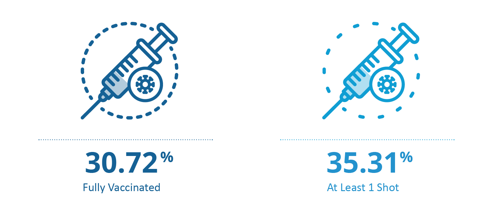
Overall, as of August this year, 35.31% of the Medicare beneficiaries have received at least one vaccine shot, and 30.72% of the Medicare beneficiaries are fully vaccinated (including the Johnson & Johnson one shot vaccine). The full vaccination rate also varies greatly across US geographies, and is likely related to different levels of access to healthcare, presence of ACO enrollment, and community distress scores. We will discuss these breakdowns in more detail in later sections of this blog.

A Breakdown by ACO Enrollment and DCI (Distressed Community Index)
ACOs are groups of doctors, hospitals, and other health care providers, who come together voluntarily to give coordinated high-quality care to their Medicare patients to ensure that patients get the right care at the right time.5 ACOs also share in the savings they achieve on their Medicare patients. Our previous blog explains more on ACOs and what ACO success entails in great detail.
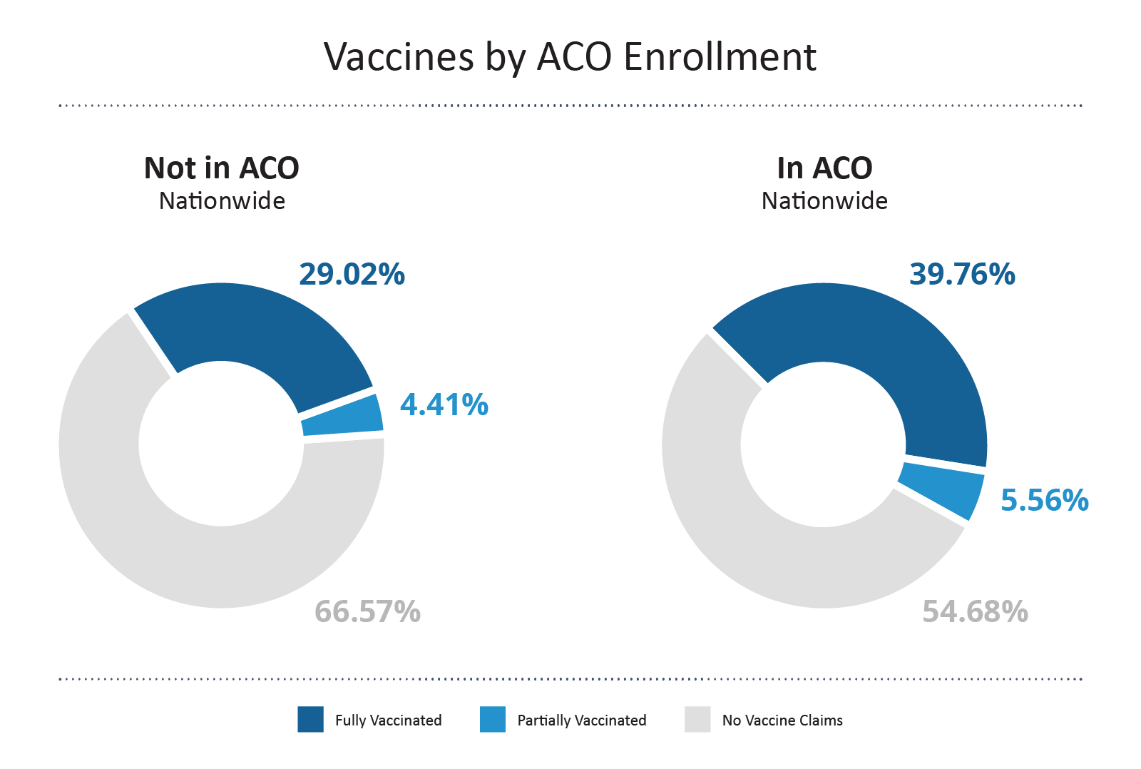
In a direct comparison, beneficiaries enrolled in an ACO show a higher full vaccination rate compared to those who are not in an ACO by ~10%. This suggests that ACOs and their management of beneficiaries positively impacted the action to get vaccine shots.

The Distressed Community Index examines economic well-being at the zip code level to provide a detailed view of the divided landscape of American prosperity.6 The index gives tiers to the regions across the US by looking at high school diploma rate, poverty rate, unemployment rate, housing vacancy rate, median household income, change in employment and change in establishments. DCI is a valuable tool when evaluating how the social determinants of health (SDOH) impact American communities.
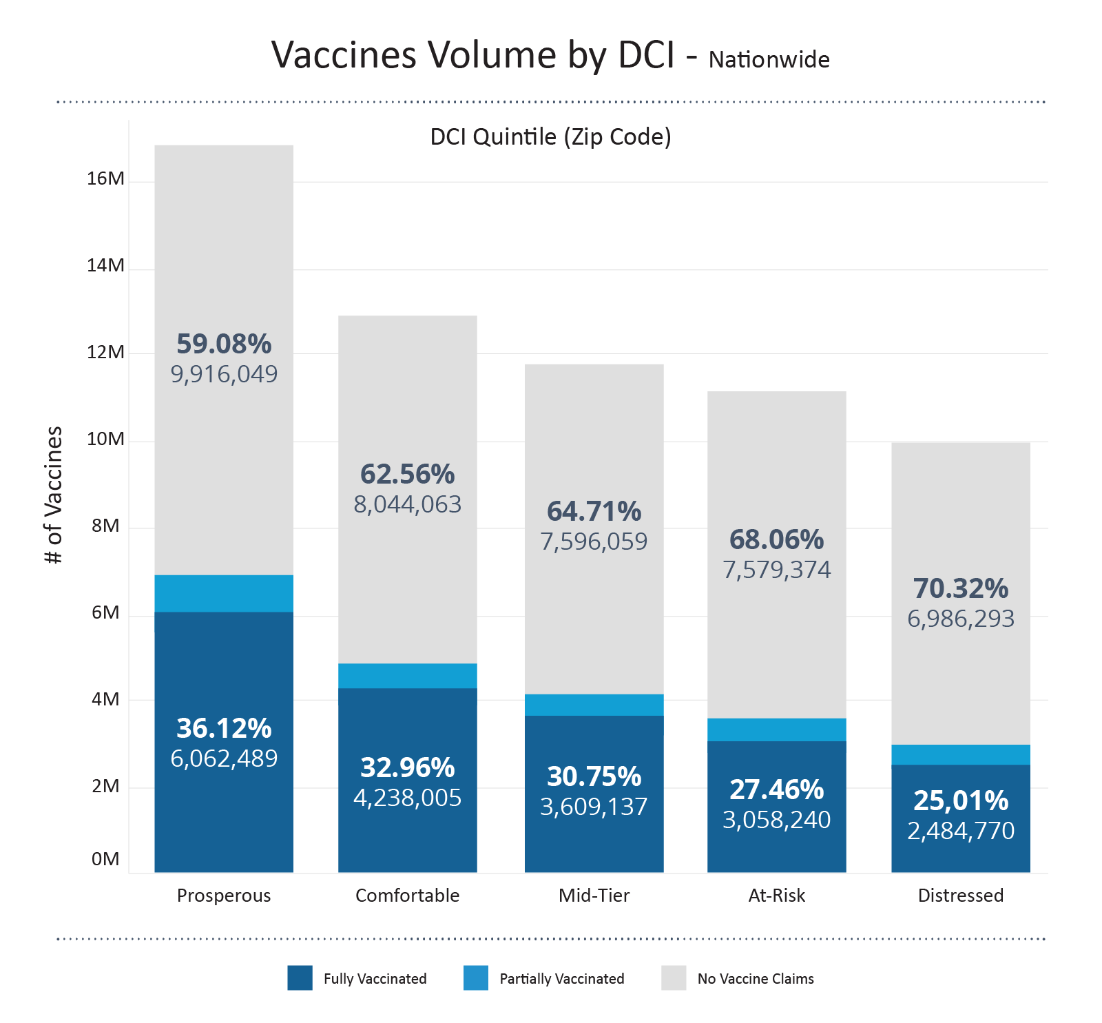
Pairing up each Medicare beneficiary to their zip codes and corresponding DCI, we see that the volume of fully vaccinated beneficiaries is almost 2.5 times higher in prosperous communities compared to that of distressed communities. However, it should also be mentioned that there still remains a great portion of beneficiaries in prosperous communities (and other tiers) that remain unvaccinated. Although some of the percentages may come from not registering insurance information when receiving vaccines, it still reminds us of the roadblocks to a more vaccinated, more COVID protected future.

Combining the ACO enrollment and DCI, if we want to take a closer look, we can take Kern County in California (home to Bakersfield, CA) as an example. This particular county is assessed to have a DCI of 4, the second-to-highest distressed tier according to the Economic Innovation Group. From the tables below, we see that for the general population in Kern County, California, the full vaccination rate remains low compared to the national Medicare average; however, if we only zoom into those who are enrolled in ACOs, the full vaccination rate is up to 35.69%, higher than the 30.72% Medicare average.
| Status | Count | Percentage |
|---|---|---|
| No Vaccine Claims | 88,075 | 72.12% |
| Partially Vaccinated | 4,827 | 3.95% |
| Fully Vaccinated | 29,213 | 23.92% |
| Status | ACO Enrollment | Count | Percentage |
|---|---|---|---|
| No Vaccine Claims | Yes | 6,415 | 58.20% |
| Partially Vaccinated | Yes | 673 | 6.11% |
| Fully Vaccinated | Yes | 3,934 | 35.69% |
We can do a similar exploration on geographies that have a less distressed community index. Let’s take Tompkins County in New York State (home to Ithaca, NY) as an example, which is rated as “comfortable.” The overall population has a full vaccination rate of 56.45%, higher than the national average. For such a highly-vaccinated population in Tompkins County, the ACO enrollees show an even higher percentage of being fully vaccinated, averaging 67.02%.
| Status | Count | Percentage |
|---|---|---|
| No Vaccine Claims | 6,709 | 38.59% |
| Partially Vaccinated | 861 | 4.95% |
| Fully Vaccinated | 9,815 | 56.45% |
| Status | ACO Enrollment | Count | Percentage |
|---|---|---|---|
| No Vaccine Claims | Yes | 1,427 | 27.70% |
| Partially Vaccinated | Yes | 272 | 5.28% |
| Fully Vaccinated | Yes | 3,452 | 67.02% |
Provider Type and Vaccine Brands
How are Medicare beneficiaries getting vaccinated, by whom, and what brand of vaccine are they getting? We have linked the vaccine claims data with the provider specialties and broken down the information by brand, type of provider, and first/second vaccine shot.
Overall, the majority of vaccine shots are being given at mass immunization sites, centralized flu, family practices, internal medicine, pediatric medicine and pharmacies. As expected, these are the most convenient, accessible, and easy vaccination locations that Medicare beneficiaries can go to.
Moderna vaccines show a higher volume compared to Pfizer, in both first shot and second shot, across different types of providers. This may be due to the fact that Pfizer vaccines have more strict storage requirements and are hence more difficult to distribute and store. Further analysis that compares vaccine volumes by brand and geographic locations can provide more information on vaccine distribution, storage, and logistics in the era of this global pandemic.
| Location | Pfizer 1 | Moderna 1 | J&J | Pfizer 2 | Moderna 2 |
|---|---|---|---|---|---|
| Mass Immunization Sites | 3,138,913 | 4,479,593 | 520,173 | 3,157,997 | 4,495,382 |
| Centralized Flu | 1,818,494 | 2,074,262 | 172,546 | 1,816,008 | 2,066,286 |
| Family Practice | 1,092,716 | 1,052,844 | 88,681 | 1,091,146 | 1,041,930 |
| Internal Medicine | 921,918 | 720,792 | 48,273 | 926,878 | 735,270 |
| Pediatric Medicine | 286,461 | 273,339 | 18,985 | 286,281 | 273,114 |
| Pharmacy | 107,760 | 372,325 | 55,614 | 108,225 | 377,295 |
A Payer Source Breakdown for Vaccine Shots
With a total over 27 million beneficiaries enrolled in Medicare Advantage plans, we see 33.11% of them being fully vaccinated. This is slightly higher than the rate for the overall Medicare population (30.72%).
Judging from the volume of fully vaccinated beneficiaries, we can see the major players include: UnitedHealth Group, Humana, CVS Health, Anthem, Kaiser Foundation Health Plan, Centene Corporation, Blue Cross Blue Shield, CIGNA. These are big groups in the industry, so it would not appear surprising that they are the major players in getting COVID-19 vaccine claims. However, if we switch the angle and look at the percent of being fully vaccinated, smaller organizations, such as MFA Lifeworks (total enrollment of 620 beneficiaries) has the highest vaccination rate, 85.97%.
Want the detailed report on vaccination counts (by county, provider & type, by Medicare Advantage payers)?
Subscribe to CareJourney’s JumpStart for a detailed view on the dashboards we have created.
How CareJourney Can Help
To support our friends along this journey, CareJourney and its access to 100% Medicare fee-for-service data and other data sets including commercial data, can help to provide the following insights:
- Dive into the vaccinated and unvaccinated fee-for-service populations to understand if there are factors that impede access to a vaccine
- Evaluate a market’s willingness to accept new interventions before moving forward
- Highlight providers and provider groups and their beneficiary’s vaccination rate to highlight areas of opportunity
If you are interested in understanding how CareJourney’s analytics can help your organization, we want to hear from you. If you are currently a member, please reach out to your member services analyst for more information. If you’re not a CareJourney member, email us at jumpstart@carejourney.com.
Not ready for a meeting? Check out our resources to learn how CareJourney helps payer, provider, and pharma organizations reduce the total cost of care and improve care quality.
- 1. Zimmer, Carl, et al. “Coronavirus Vaccine Tracker.” The New York Times, The New York Times, 10 June 2020, https://www.nytimes.com/interactive/2020/science/coronavirus-vaccine-tracker.html.
- “Covid-19 Frequently Asked Questions.” U.S. Food and Drug Administration, FDA, https://www.fda.gov/emergency-preparedness-and-response/coronavirus-disease-2019-covid-19/covid-19-frequently-asked-questions#:~:text=On%20December%2011%2C%202020,)%20of%20a%20vaccine.
- Ruffes, Vanessa. “Verify: Is There a Difference between COVID-19 Vaccine Dose One and Two?” Wcnc.com, 19 Jan. 2021, https://www.wcnc.com/article/news/verify/verify-difference-covid-vaccine-dose-one-two/275-456bdc78-f476-4c25-9dac-eb26a1aaf447.
- “HRSA Announces Coverage of over Five Million Claims for Covid-19 Vaccinations for Uninsured Individuals.” Official Web Site of the U.S. Health Resources & Services Administration, 17 June 2021, https://www.hrsa.gov/about/news/press-releases/coverage-uninsured-covid19-vaccinations-claims.
- “Accountable Care Organizations (ACOs).” CMS, https://www.cms.gov/Medicare/Medicare-Fee-for-Service-Payment/ACO.
- “The Spaces between Us: The Evolution of American Communities in the New Century.” Economic Innovation Group, https://eig.org/dci.
