As plans prepare for Open Enrollment (OE), it’s critical to understand what beneficiaries need as these Medicare Advantage (MA) plans look to recruit new and retain existing beneficiaries. It’s also critical for plans to understand historical data in specific regions to make appropriate expansion decisions. In this blog, we will provide insight into areas that appear to be underserved by MA, areas where MA penetration is trending down, and areas actively growing. These insights will give you a high-level understanding of potential factors to consider when thinking about expansion. Let’s begin by looking at the MA Enrollment trends from last year’s OE period.
MA Enrollment Trends From Last Year’s Open Enrollment Period
Overall, MA enrollment grew from December 2020 to February 2021. In February of 2021, we saw over 26 million beneficiaries; while in December of 2020, we saw around 25 million beneficiaries. This growth in MA has been a trend across the past 15 years or so, leaving some to wonder when MA will eventually hit the 50% mark (39% penetration in 2020, 42% in 20211).
Specifically, in February 2021, the average county MA penetration rate was 35% (with the median county MA penetration rate of 36%). This was an increase from December 2020 where the average county penetration rate and median county penetration rate were both 32%.
Across the counties that saw the highest MA penetration, we see that Puerto Rico is a clear leader in terms of high enrollment rates. In fact, their county with the lowest MA penetration rate is 69%, which is still an incredibly high enrollment rate. We also see high MA enrollment across counties in Michigan, Connecticut, Alabama, Georgia, Hawaii.
To map and quantify the highest MA enrollment, we have averaged the county MA penetration rates by state or territory below in Table 1.
| State/Territory | Average County Medicare Advantage Penetration Rate2 |
|---|---|
| Puerto Rico | 81% |
| Michigan | 49% |
| Connecticut | 48% |
| Alabama | 48% |
| Georgia | 48% |
| Hawaii | 48% |
| Rhode Island | 47% |
| Minnesota | 47% |
| New York | 47% |
| Pennsylvania | 46% |
Table 1. The top ten states and territories with the highest average county MA penetration rate.2
In looking specifically at the raw enrollment numbers to provide a sense of scale, we can also see that the top ten counties with the highest overall enrollment volume did not change from December of 2020 to February of 2021. When digging into 2021, the average county MA enrollment volume is 8,539 beneficiaries, with a median of 2,155 beneficiaries. Below you will find Table 2 outlining the top ten counties with the highest MA enrollment in February of 2021.
| County | MA Beneficiary Enrollment Volume2 |
|---|---|
| Los Angeles, California | 816,561 |
| Miami-Dade, Florida | 348,906 |
| Maricopa, Arizona | 346,779 |
| Harris, Texas | 312,255 |
| Cook, Illinois | 297,689 |
| San Diego, California | 283,327 |
| Orange, California | 283,059 |
| Riverside, California | 237,401 |
| Broward, Florida | 203,995 |
| San Bernardino, California | 195,835 |
Table 2. The top ten counties with the highest beneficiary MA enrollment.2
Underserved Areas: Areas of Opportunity
As we prepare for the upcoming OE, it may be more important to identify areas that are still ripe for MA growth opportunity, instead of where there is heavy presence already. Upon digging into the 2021 files, we see there is a lot of room for MA growth in counties across Alaska, Wyoming, Maryland, Kansas, Montana, Nebraska, North Dakota.2 As noted in Table 3 below, in these states we see an average county MA penetration rate of less than 25%. Two questions come to mind: is this an area where MA plans have their eyes set on? Do any plans have an offering that might best treat these areas?
| State/Territory | Average County Medicare Advantage Penetration Rate2 |
|---|---|
| Nevada | 20% |
| South Dakota | 20% |
| Vermont | 19% |
| North Dakota | 18% |
| Montana | 16% |
| Nebraska | 14% |
| Kansas | 12% |
| Maryland | 11% |
| Wyoming | 5% |
| Alaska | 1% |
Table 3. The ten states and territories with the lowest average county MA penetration rate (February 2021).
Trending Down
While identifying opportunities for growth, we also want to consider counties that have lost MA market share. Specifically, we see that Mineral, Nevada lost the most market share at 12%. As noted in Table 4, six of the top ten counties with the largest MA loss sit within the Colorado market.
| County | Counties with Largest Decrease in MA Penetration2 |
|---|---|
| Mineral, Nevada | 12% |
| Clatsop, Oregon | 9% |
| Garfield, Colorado | 5% |
| Moffat, Colorado | 4% |
| Washington, Mississippi | 3% |
| Routt, Colorado | 2% |
| Dawes, Nebraska | 2% |
| Rio Grande, Colorado | 2% |
| Eagle, Colorado | 2% |
| Pitkin, Colorado | 2% |
Table 4. The 10 counties that lost the most MA enrollment penetration.2
Areas Actively Growing
A final way to think about county-level MA growth is by identifying areas who grew the most in terms of increasing their MA enrollment penetration. On average, the county growth rate for MA penetration was 3%.
Overall, we saw the highest growth among many of the counties in the Virgin Islands (with both St. Thomas and St. John at a 27% penetration rate). This growth helped the Virgin Islands leave the list of top ten states with counties ripe for MA growth when looking back in December 2020. Also of note, there were six counties in Mississippi in the top 20 for most MA penetration growth. See Table 5 for the top 20 results.
| County | Average of Difference In MA Penetration2 |
|---|---|
| St. Thomas, Virgin Islands | 27% |
| St. John, Virgin Islands | 27% |
| St. Croix, Virgin Islands | 22% |
| Washington, Oklahoma | 14% |
| Greenlee, Arizona | 14% |
| Clay, Mississippi | 13% |
| Kay, Oklahoma | 12% |
| Chickasaw, Mississippi | 11% |
| Issaquena, Mississippi | 10% |
| Chambers, Texas | 10% |
| Clear Creek, Colorado | 10% |
| Blaine, Nebraska | 10% |
| Guadalupe, New Mexico | 10% |
| Calhoun, Mississippi | 10% |
| Bent, Colorado | 10% |
| Lee, Mississippi | 9% |
| Ingham, Michigan | 9% |
| Webster, Mississippi | 9% |
| Harford, Maryland | 9% |
| Milam, Texas | 9% |
Table 5. The top 20 counties that grew the most in terms of MA enrollment penetration.2
What Do We Know About Areas With High MA Enrollment?
While it’s easy to think about the enrollment trends as a series of increases and decreases, the larger questions become: what do we know about areas with high MA enrollment penetration and how does that impact patients?


What Do We Know About Areas With High MA Enrollment?
While it’s easy to think about the enrollment trends as a series of increases and decreases, the larger questions become: what do we know about areas with high MA enrollment penetration and how does that impact patients?
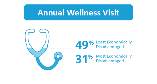
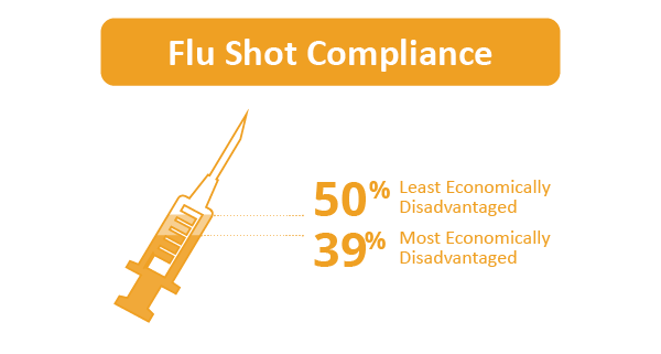
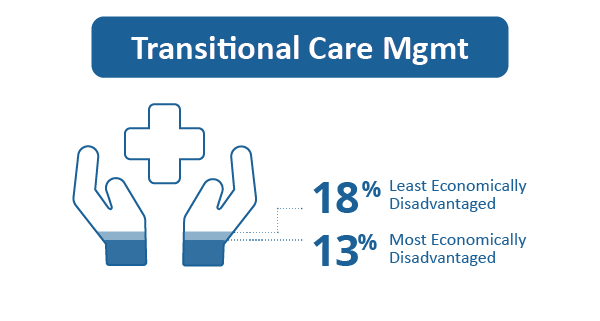
Anecdotally, we know that in markets where there is a significant portion of the FFS population being managed by CMS Accountable Care Organizations (ACOs), there is often less MA enrollment. Additionally, we know that ACOs on average help to decrease the impact of economic distress on healthcare trends in the areas they serve. For example, in areas where there are ACOs, the range in Annual Wellness Visit rates between the most economically disadvantaged areas and the least economically disadvantaged areas is 31%-49%, respectively. Similarly, we see the same trend for flu shot compliance (39% in the most economically disadvantaged areas and 50% in the least economically disadvantaged areas) and Transitional Care Management (13% in the most economically disadvantaged areas and 18% in the least economically disadvantaged areas).
On the flip side, in areas where there is no ACO, we see the range in Annual Wellness Visit rates between the most economically disadvantaged areas and the least economically disadvantaged areas is 16%-28%, respectively. Similarly, we see the same trend for flu shot compliance (33% in the most economically disadvantaged areas and 42% in the least economically disadvantaged areas) and Transitional Care Management (8% in the most economically disadvantaged areas and 13% in the least economically disadvantaged areas).
With this in mind, in areas where MA has higher penetration, is there an opportunity for plans to help raise the bar for managing the populations they serve in a similar capacity?
Additionally, we know that on average there appears to be a small correlation between higher county MA penetration and rising unemployment, poverty rates, and Supplemental Nutrition Assistance Program (SNAP) usage (See Table 6).
| February 2021 Penetration | December 2020 Penetration | |
|---|---|---|
| Unemployment Rate | 0.38 | 0.36 |
| Poverty Rate | 0.40 | 0.39 |
| SNAP Usage Rate | 0.48 | 0.46 |
Table 6. Assessing the correlation of MA enrollment penetration rates with American Community Survey (ACS) unemployment, poverty rates, and SNAP usage metrics on the county level.2,3
What Does This Mean for MA Plans?
When analyzed together, this finding presents a relevant and impactful opportunity for MA plans. In markets with higher MA penetration, we see higher volumes of economic disparity. Furthermore, in these areas there is likely less ACO or other VBO presence.
This represents an opportunity for MA plans to help fill the gap while meaningfully and effectively serving a population whose health journey shows signs of less preventative care and likely worse outcomes.
When looking at the correlations between the unemployment, poverty rates, and SNAP usage metrics with the MA star ratings we see a negative correlation demonstrating that plans in counties with higher economic disparity can still get a high star rating even though the population is more disadvantaged (Table 7). For these five-star plans, this is particularly significant because they can better manage a disadvantaged population, continue to manage their MA business, and enroll beneficiaries at any time (given their record of strong performance).
| MA Star Rating | |
|---|---|
| Unemployment Rate | -0.06 |
| Poverty Rate | -0.08 |
| SNAP Usage Rate | -0.05 |
Table 7. Assessing the correlation of MA star ratings with American Community Survey (ACS) unemployment, poverty rates, and SNAP usage metrics on the county level (2021 star ratings and 2019 ACS results).
While the case for a five-star plan is strong, serving disadvantaged communities is still a level playing field for all plans. Specifically, we do not see a correlation between the penetration rates and a plan’s star measures. Any plan, regardless of their star rating, can work to increase their penetration in markets and make an impact on those populations.
How CareJourney Can Help
To support MA plans along this journey, CareJourney and its access to 100% Medicare fee-for-service data and other data sets including commercial data, can help to provide the following insights:
- Learn more about the fee-for-service populations within current markets seeing lower MA penetration rates to understand the populations you could be touching in those areas.
- Identify look-alike populations for new growth among the fee-for-service data assets that would mirror markets in which you’ve already made a significant impact.
- Establish fee-for-service benchmarks for those populations as you enter those new markets to show the ROI and impact of your plan in that market.
- Highlight providers and provider groups who have MA exposure within those markets, as well as providers who are overall performing well, to understand which physicians can best support, partner, or potentially join forces with you for the strategies you would look to deploy in these markets.
If you are interested in understanding how CareJourney’s analytics can help your organization, we want to hear from you. If you are currently a member, please reach out to your member services analyst for more information. If you’re not a CareJourney member, email us at jumpstart@carejourney.com, or you can learn more by requesting a meeting.
Not ready for a meeting? Check out our resources to learn how CareJourney helps payer, provider, and pharma organizations reduce the total cost of care and improve care quality.
- KFF. (2021). Medicare Advantage in 2021: Enrollment Update and Key Trends. [online]
- CMS. (2021). 2021 Marketplace Open Enrollment Period Public Use Files. [online] Available at: https://www.cms.gov/research-statistics-data-systems/marketplace-products/2021-marketplace-open-enrollment-period-public-use-files
- ACS. (2019). 2021 ACS Demographic and Housing Estimates. [online] Available at: https://data.census.gov/cedsci/table?q=United%20States&tid=ACSDP1Y2019.DP05
