On July 1, 2022, the Federal Price Transparency Rule (the Rule) went into effect for commercial health plans. Under these requirements, certain health insurers must disclose their in-network negotiated rates as well as their out-of-network allowed rates. The insurers are required to publicly provide this data on their websites as machine-readable files (MRFs) that follow a CMS-provided schema. The purpose of the Rule is to help outside organizations to understand these negotiated prices with providers in an effort to eventually help consumers price-shop for their healthcare services.
While most payers comply with the Rule to some degree, the MRFs are monstrous in both size and complexity. Only a few organizations have been able to parse the data. Each file produces gigabytes and gigabytes of data – the vast majority of it not applicable to any meaningful analysis. Moreover, each payer also complies with the requirements differently, for example by using different billing code modifiers in their disclosed rates, which leads to difficulties in comparing prices “apples to apples.” The net result of the size and complexity of the MRFs is that garnering insights from this very important data is difficult for most organizations and impossible for consumers. However, combining MRF data with data in CareJourney’s offering allows us to understand price variations between plans, providers, and markets.
Distilling a Data Dump
Generating all of this data was certainly not an easy lift for those plans required to comply with the Rule. The enormity of this requirement possibly resulted in difficulties producing high quality data sets. These data quality issues could result in misleading information to consumers.
From our initial analysis of the MRFs, it is clear that many of these entities have negotiated rates for specific procedures with providers who would never bill for one of those procedures. Improbable provider-price combinations exist in the MRFs. For instance, social workers do not perform knee replacements, but we observed negotiated rates for these procedure-provider combinations.
Additionally, we saw numerous instances of a rate for a provider under multiple different “Employer Identification Numbers”, which often are associated with practice groups. In one analysis of orthopedic surgeons in the Chicago area, we found rates for one doctor under four different practice groups. In some instances, this could be logical: two of the practice groups merged. However, practice group three was where the physician completed their residency (many years prior) and practice group four is the main competitor to the two merged practice groups.
For payers, keeping this type of data in their system is not problematic. They will hopefully never see a claim for a social worker performing a knee replacement or a doctor billing under a competitor’s practice group identifier, so keeping all forms of extraneous data in their data warehouse is the path of least resistance. Nothing in the Rule requires the payers to provide only rates/contract information for procedures that are actually billed by that physician.
For anyone seeking to use the Price Transparency data for any number of emerging use cases, the data must be distilled into high quality, useful data sets. At CareJourney we succeeded in combining these MRFs with our data assets to create insightful reports. In the above example, we can combine informational data on the specialities of each provider and claims data that tells us how many of each procedure a provider performed to remove irrelevant rates and retain only applicable billing rates. CareJourney also has robust data on types and volumes of procedures performed at individual facilities – surgical centers, outpatient facilities, and hospitals – and the relationships between providers, hospital facilities, and hospital systems. While the task at hand is still complex, we have been able to create a synergy between CareJourney data and price transparency data. This allows for a better understanding of what providers are paid for procedures by each payer.
Request Price Transparency Insights for Your Market
See price transparency insights by procedure for the main payers in your market.
What are we finding?
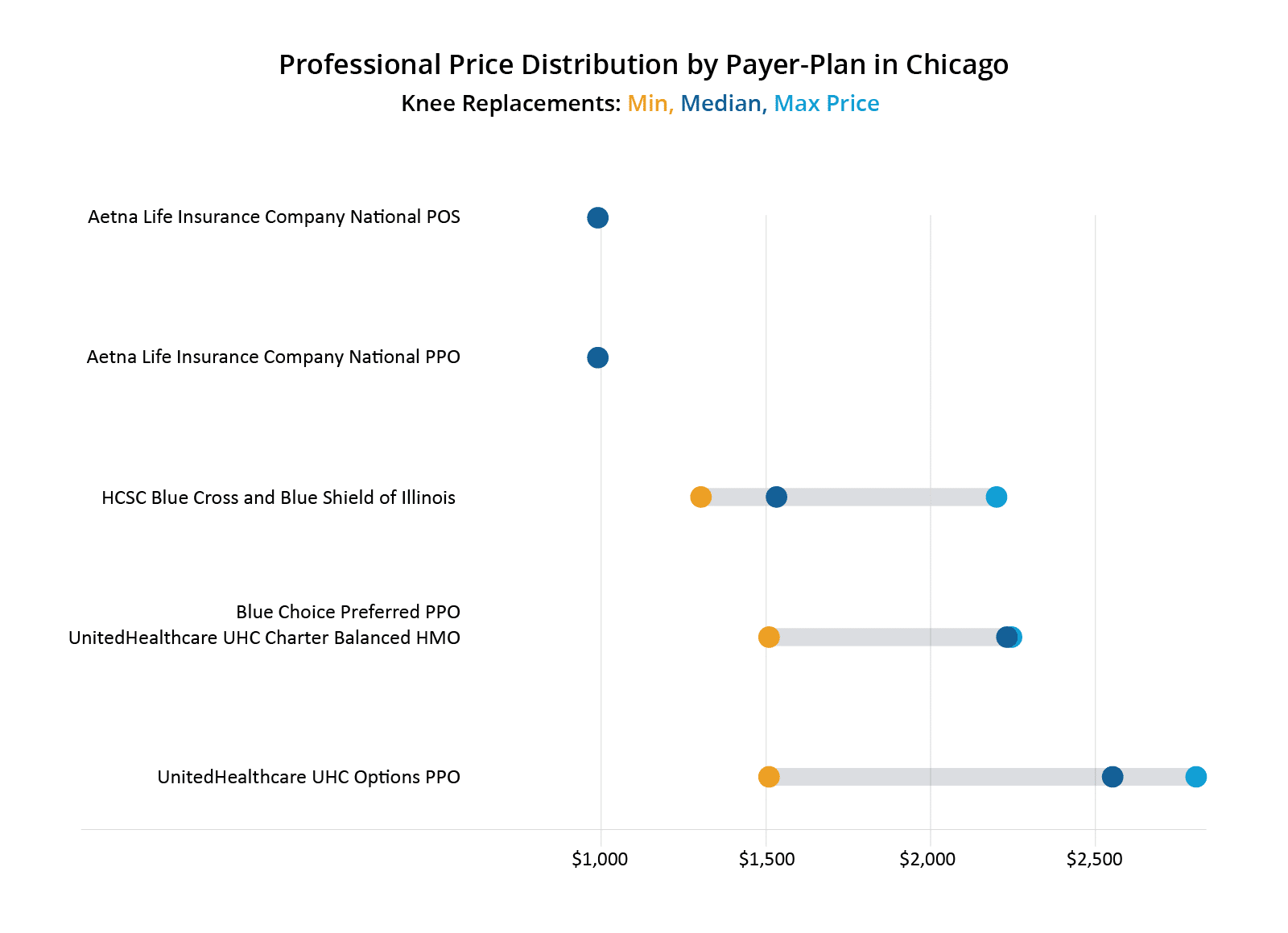
Rates for a specific procedure code can have a “professional” and an “institutional” component. In simple terms, the professional rate can be thought of as what a provider charges for performing the services whereas an institutional rate is what the facility charges for using the space, supplies, and support staff. The chart below compares the negotiated professional fees for a knee replacement procedure amongst three separate payers and five total plans in the Chicago area.

As shown in the figure, both United plans pay a higher median negotiated rate than the other payers. Aetna has only one price across all of the providers doing knee replacements in Chicago in these plans, at slightly under $1,000. What drives the difference in rates between Aetna at the low end and United at the high end? There are, of course, factors such as negotiating power/skill, unequal information in the hands of providers, and market share. But there are also possibly technical reasons for this difference.
One of the biggest differences between Aetna and HCSC/United in the above charts is how Aetna uses billing code modifiers. Billing code modifiers are used to tell us something additional about the procedure. For example, billing code modifier 53 is used to indicate that the procedure was started but not finished for some reason. Billing code modifier 30 indicates a medical-legal evaluation was done for that procedure code. Aetna utilized billing code modifiers in their negotiated rates whereas HCSC and United did not. Aetna’s rate, which is uniform across all providers and the lowest of the bunch, uses many billing code modifiers. Trying to compare Aetna’s rates to the other payers has been complicated. Specifically, Aetna utilizes billing code modifiers 54, 55, and 56 (in addition to others). Billing code modifier 54 indicates that the surgeon only performed the surgical portion, not the post operative care, modifier 55 is for the post-operative care and modifier 56 is for the pre-operative care.
One surgeon may not bill with modifiers 54 and 55 together for the same procedure, since the very existence of modifier 54 means that the procedure was split across multiple clinicians. However, Aetna does not provide a modifier-free rate for knee replacements. Comparing Aetna’s rate to United’s rate, therefore, requires making certain assumptions.
- Is United’s rate with no modifiers equal to Aetna’s rate for a knee replacement with modifier 54 plus the rate with modifier 55?
- What about modifier 56 for the preoperative care?
| Provider | Payer | CPT Code | Modifier | Rate |
|---|---|---|---|---|
| Dr. S | Aetna | 27447 | 54 (surgical portion) | $991.04 |
| Dr. S | Aetna | 27447 | 55 (post-op care) | $198.21 |
| Dr. S | Aetna | 27447 | 56 (pre-op care) | $132.14 |
| Dr. S | Aetna | 27447 | Sub-Total of 54-56 | $1,321.39 |
| Dr. S | HCSC BCBS | 27447 | $1,533.04 |
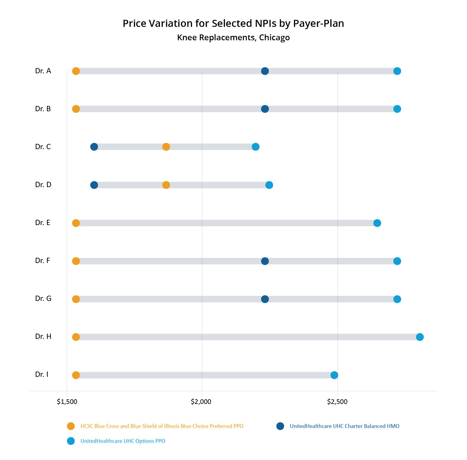
The price transparency data shows its warts when attempting to compare apples-to-apples for price-shopping; however, it is still quite useful in understanding how physicians are compensated for their services relative to each other and also from plan to plan. The chart below shows a selection of doctors in the Chicago area and the range of negotiated rates for knee replacements by a selection of Payer-Plan combinations. These doctors were selected somewhat randomly. We looked for doctors that had rates for at least two different payers and excluded Aetna as a payer due to uncertainty over billing code modifiers. The figure shows that United’s PPO plan has the highest negotiated rates overall. Most doctors have a ~$1000 spread between their highest and lowest negotiated rates for knee replacements, which represents a 75-100% increase over their lowest negotiated rates.

What price transparency data doesn’t tell us is why certain doctors are paid more or less than other doctors. Looking at the above chart, you can see that HCSC pays one rate across all doctors – except for 2 (Drs. C and D). Did they just negotiate better? Oddly, those two doctors have the lowest possible rates of the selected group. So why is HCSC willing to pay them more than the other doctors on this list but United is paying them substantially less than the other doctors?
What About Quality?
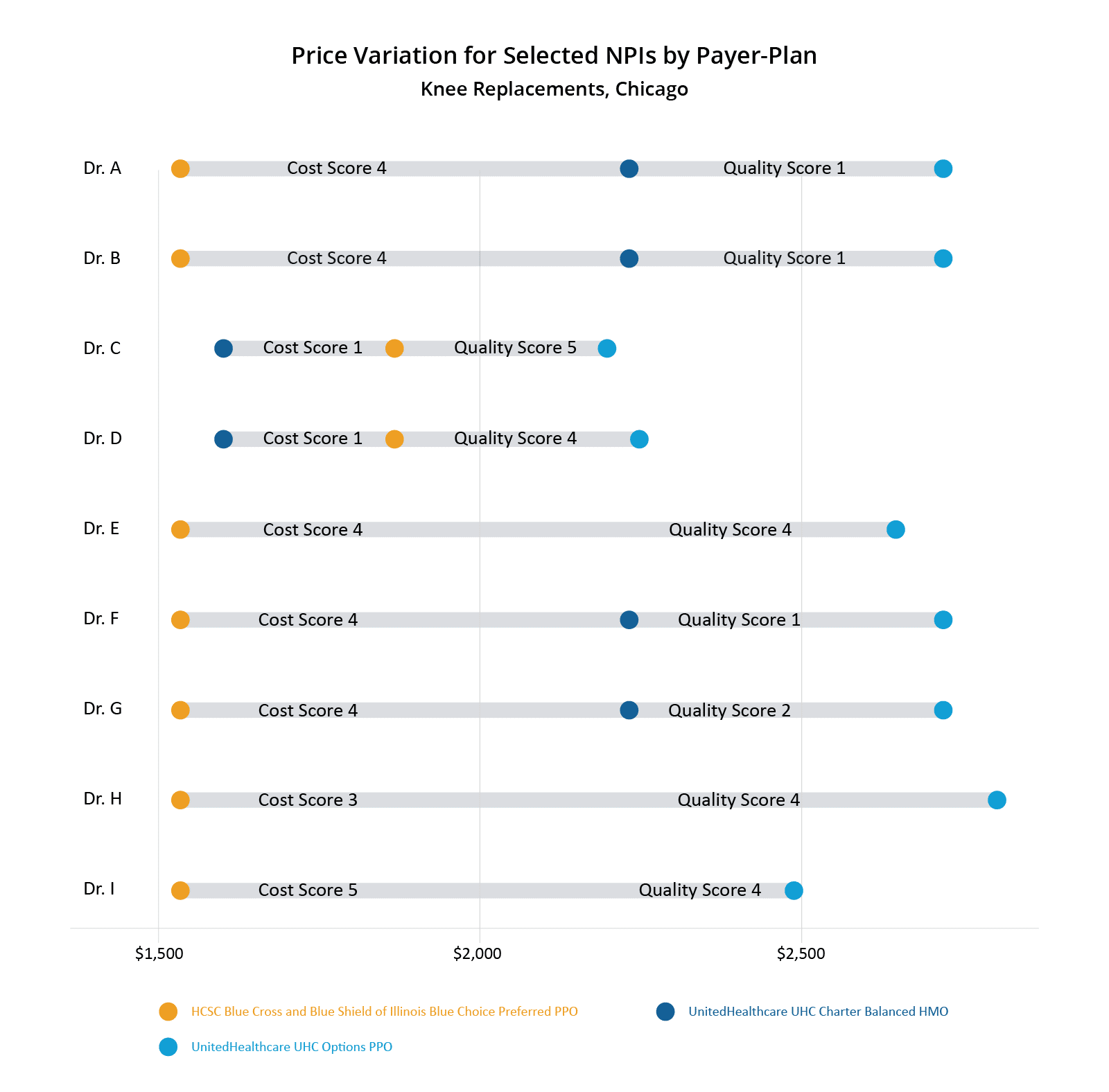
CareJourney has created provider cost and quality ratings called the Provider Performance Index (PPI). For PPI Cost Scores, we look at how a physician’s observed costs compare to expected costs. Expected costs are created via a multi-factor algorithm that accounts for among other things, the patient’s risk score, demographics, and episode length. PPI Quality Scores evaluate providers based on outcomes measures including Global Appropriateness Measures, readmission rates, and other quality measures commonly used in the industry. Each PPI score is on a 1-5 scale with 5 being the highest, like CMS Star Ratings.
We added the knee replacement specific PPI Cost scores and overall PPI Quality scores to the above chart showing the negotiated price variation between selected NPIs. Through this lens, you can see that Drs. C and D have the best PPI Quality scores amongst the selected doctors, but the worst PPI Cost scores.This means that generally Drs. C and D have observed costs that are higher than expected, but they also have better outcomes than their peers.

Looking at this data, one could guess that United penalizes doctors who have higher than expected observed costs for knee replacements by capping their negotiated rates lower than their peers. One could also draw the conclusion that HCSC rewards doctors for better outcomes by increasing negotiated rates for doctors who routinely provide better care.
CareJourney Can Help You
This analysis presented here is just a tiny sliver of the vast amount of insights that could be generated from the publicly reported price transparency information out there. CareJourney has positioned itself to help find value with the price transparency data. We have obtained price transparency data for payers and plans across the U.S. This data covers a large number of different procedures and conditions across numerous specialty lines. We combined this data with our best-in-class CareJourney analytics to create actionable insights for our members.
Please fill out the form at the top of the page to learn how to benefit from CareJourney’s price transparency insights.
