What Drove Success for ACO REACH’s Highest Performing ACOs in 2022?
By Erica Everhart
January 23, 2024
On October 23, CMS released the results and public use file for Global and Professional Direct Contracting (now known as ACO REACH)’s 2022 performance year. The program had 99 participating ACOs in 2022, of which 81 ACOs attained gross savings and 75 ACOs attained net savings (after applicable discounts, CMS shared savings, sequestration, and risk corridors).
In total, the 99 ACOs saved approximately $870M in gross savings (3.7%), including $371.5M in savings to Medicare.
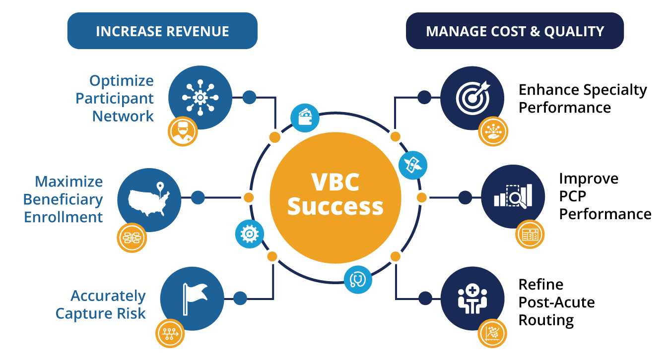
At CareJourney, we have identified several key drivers of ACO success:
- Optimize Participant Network
- Maximize Beneficiary Enrollment
- Accurately Capture Risk
- Enhance Speciality Performance
- Improve PCP Performance
- Refine Post-Acute Routing
When we applied this framework to the 2022 Performance Year REACH ACOs, we found that the ACOs that realized the highest savings rate performed better along these drivers than those that realized losses.
As compared to the Lowest Performing REACH ACOs, the group of Highest Performing REACH ACOs:
- Had 20% higher risk scores than Lowest Performing ACOs.
- Utilized primary care providers that provided higher quality care at a lower cost.
- Had a lower overall rate of costly procedures amongst their population.
- Saved more than $29M in 2022 across the ten chronic condition episodes by servicing those episodes for less than the calculated expected amounts.
- Utilized more cost effective post-acute care.
Note: Though we are comparing a group of high performers to a group of low performers in this analysis, CareJourney has these metrics at the ACO- and TIN-levels, allowing members to identify and address the opportunity within their organization. Please reach out to see data at these levels!
The first step of our analysis of how Highest Performing ACOs drive savings, was the creation of two cohorts of ACOs to compare:
- The Highest Performing ACOs were all non-High-Needs ACOs that had greater than ten percent (10%) gross savings.
- Lowest Performing ACOs were all non-High-Needs ACOs that had gross losses.1
We used CareJourney datasets sourced from Medicare claims data to analyze and compare utilization patterns for these two groups. A summary of these two comparison groups with some standard value-based care utilization measures is in the table and charts below.
| Highest Performing ACOs | Lowest Performing ACOs | |
|---|---|---|
| # ACOs | 21 | 18 |
| # Benes | 191,548 | 466,360 |
| Avg. HCC Score | 1.198 | 1.001 |
| % Dual | 6% | 7% |
| % Frail Elderly | 10% | 11% |
| % CCI3+ | 46% | 37% |
| % AWV Compliance | 48% | 43% |
| % Transitional Care Mgmt Services | 27% | 19% |
| % Flu Shot Compliance | 56% | 56% |
| IP/1K | 273 | 273 |
| % Avoidable ED Visits | 24% | 24% |
| % Readmissions | 14% | 14% |
| SNF Discharges/1K | 63 | 72 |
| PQI 90 – Total Composite | 3,870 | 3,754 |
| PQI 91 – Acute Composite | 1,397 | 1,416 |
| PQI 92 – Chronic Composite | 2,473 | 2,338 |
We will evaluate many of these measures below, but at a high level we can quickly see that the highest performing ACOs had fewer beneficiaries per ACO, and those beneficiaries had higher risk scores. Demographically, the populations are similar: a similar percentage of beneficiaries who are simultaneously eligible for Medicare and Medicaid (dual-eligible beneficiaries), and a similar percentage of beneficiaries that are categorized as Frail Elderly in the Frailty Cohorts.2
Evaluating ACO Performance Within Drivers of Success Framework
The CareJourney Drivers of ACO Success are not independent variables – success with one driver frequently implicates other drivers. Optimizing your participant network can come in the form of seeking out rockstar providers, or it can also come in the form of taking the rockstar providers you already have and making them even better (improving PCP performance). Similarly, maximizing beneficiary enrollment can mean finding the providers that bring your organization the highest number of claims-aligned beneficiaries, or it can mean implementing a voluntary alignment procedure combined with community outreach to bring new beneficiaries to your organization. For this analysis, we will take the position that the network and the beneficiary base were already set and focus on the other four drivers that speak more to analyzing the performance of providers.
Accurately Capture Risk Score
Risk score capture rates could constitute an entire blog series unto itself. CareJourney works with ACOs and Medicare Advantage Plans to understand risk score recapture rates and how providers are capturing diagnoses that feed into risk scores in order to get an accurate benchmark value to provide beneficiaries with the appropriate care.
Interestingly, the Highest Performing ACOs group has an average HCC score that is almost 20% higher than the Lowest Performing ACOs group. The Highest Performers also have a higher percentage of beneficiaries with three or more chronic conditions (CCI3+ on the Charlson Comorbidity Index3). Without tying in additional data sources like Part D claims or electronic health records, it is difficult to determine whether this is simply more advanced risk scoring strategies for the Highest Performing ACOs or whether the patients in the Highest Performing ACOs are actually sicker. There are a few data points that we can use to try and answer this question. Perhaps the easiest data point, however, is to look at the composition of the patient base from some demographic factors. Two of the known “sickest” populations are the Frailty Cohort of Frail Elderly and the percentage of beneficiaries that are simultaneously eligible for both Medicare and Medicaid (Dual Eligible Beneficiaries). Looking at the percentage of beneficiaries in each group that is either Dual Eligible or Frail Elderly is informative. We know that these beneficiaries have substantially higher risk scores – upwards of 50% higher. We can see that in both the Highest Performing ACOs and the Lowest Performing ACOs, the Dual-Eligible population is approximately 7% and the percentage of beneficiaries that fall into the Frail Elderly Frailty Cohort is 10.5% which would generally indicate that both cohorts should have similar risk scores. However, the Highest Performing ACOs have a beneficiary base where 46% score three or higher on the Charlson Comorbidity Index, whereas the Lowest Performing ACOs have only 37% of their beneficiaries with a 3+ score.
Coming to any conclusion regarding whether one group is particularly good at-risk scoring or one group is missing out on proper diagnoses would require a much more in depth analysis, which would push this already lengthy analysis to an extreme. If your organization is interested in learning about how CareJourney analytics can identify risk score capture accuracy, request a meeting.
Improve PCP Performance
When we look at primary care provider (PCP) performance, we typically look at a handful of preventative care utilization measures: Annual Wellness Visits, flu shot compliance, transitional care management, and avoidable emergency room visits to name a few.
As you can see in the above chart, there is a surprisingly small difference in the % Annual Wellness Visit compliance between the Highest Performing ACOs and the Lowest Performing ACOs. There is no difference at all in flu shot compliance between the two groups. There is no difference in the overall percentage of emergency department visits that are considered “avoidable.” The only preventative care measure where we see a difference between the two groups is the percentage of beneficiaries who receive a Transitional Care Management (TCM) service within thirty days of discharge from an inpatient facility.
The Highest Performing ACOs have a six percentage point edge over the Lowest Performing ACOs on transitional care management.
The two groups have an equivalent rate of readmissions after an inpatient hospitalization. Given the difference in illness burden (risk scores) between the populations, we would expect to see the sicker population – the Highest Performing ACOs – have a higher readmission rate. Assuming the Highest Performing ACOs population is actually sicker and not just more thoroughly risk coded, the increased rate of TCM amongst Highest Performing ACOs likely drives their effectively lower readmission rate.
Inpatient hospitalization rates per one thousand beneficiaries is a common measure used to evaluate PCP performance. As with readmission rates, we would expect to see the sicker population have a higher inpatient admission rate. Interestingly, despite their statistically sicker population, the Highest Performing ACOs had an equal rate of inpatient admissions per 1,000 beneficiaries to the Lowest Performing ACOs.
We can conclude from these standard VBC utilization measures that the Highest Performing ACOs are providing higher quality primary care services, however just looking at these measures does not give a strong indication into how they are doing so.
It would be ignorant to believe that these are the only measures of a primary care provider as there are many nuances to PCP performance including hard to measure factors such as how well a primary care doctor and specialists work together to care for a patient. CareJourney’s Provider Performance data provides cost and quality data for primary care doctors. Provider Performance data for primary care providers examines at the total cost of care and calculates risk adjusted expected values along six measures:
- Per beneficiary per year total cost of care spend;
- Average length of stay (days) in a long term care facility;
- Amount of money per beneficiary per year spent due to complications;
- ER Visits per 1,000 person years;
- Unplanned Hospitalizations per 1,000 person years; and,
- Mortality rate
For each measure, and for each provider, CareJourney calculates an expected value that is modeled and risk adjusted on many factors including the age, acuity, dual-status, and location of the provider’s patient panel. CareJourney then calculates the observed actual value for each measure based on 2022 Medicare claims data.
The Provider Performance data illustrated below represents data for the entire Medicare Fee For Service patient panel for each Primary Care Provider in the Highest Performing and Lowest Performing ACOs, not just those patients who are enrolled in ACO REACH. That is to say if Dr. Spock treats 100 Medicare Fee For Service (FFS) patients, thirty of whom are aligned to ACO123, Dr. Spock’s Provider Performance data looks at his performance across his 100 FFS patients and not just those in ACO123.
When looking at the charts below, the darker bars represent the calculated expected amounts. These expected amounts are very close in value for the Highest Performing ACOs and Lowest Performing ACOs. The expected amounts are risk adjusted along many factors and therefore seeing similar expected amounts allows us to draw conclusions that the makeup of the populations is similar. Therefore, when we see the Highest Performing ACOs with observed values that are lower than expected, we can feel more confident that those providers are actually providing higher quality care.
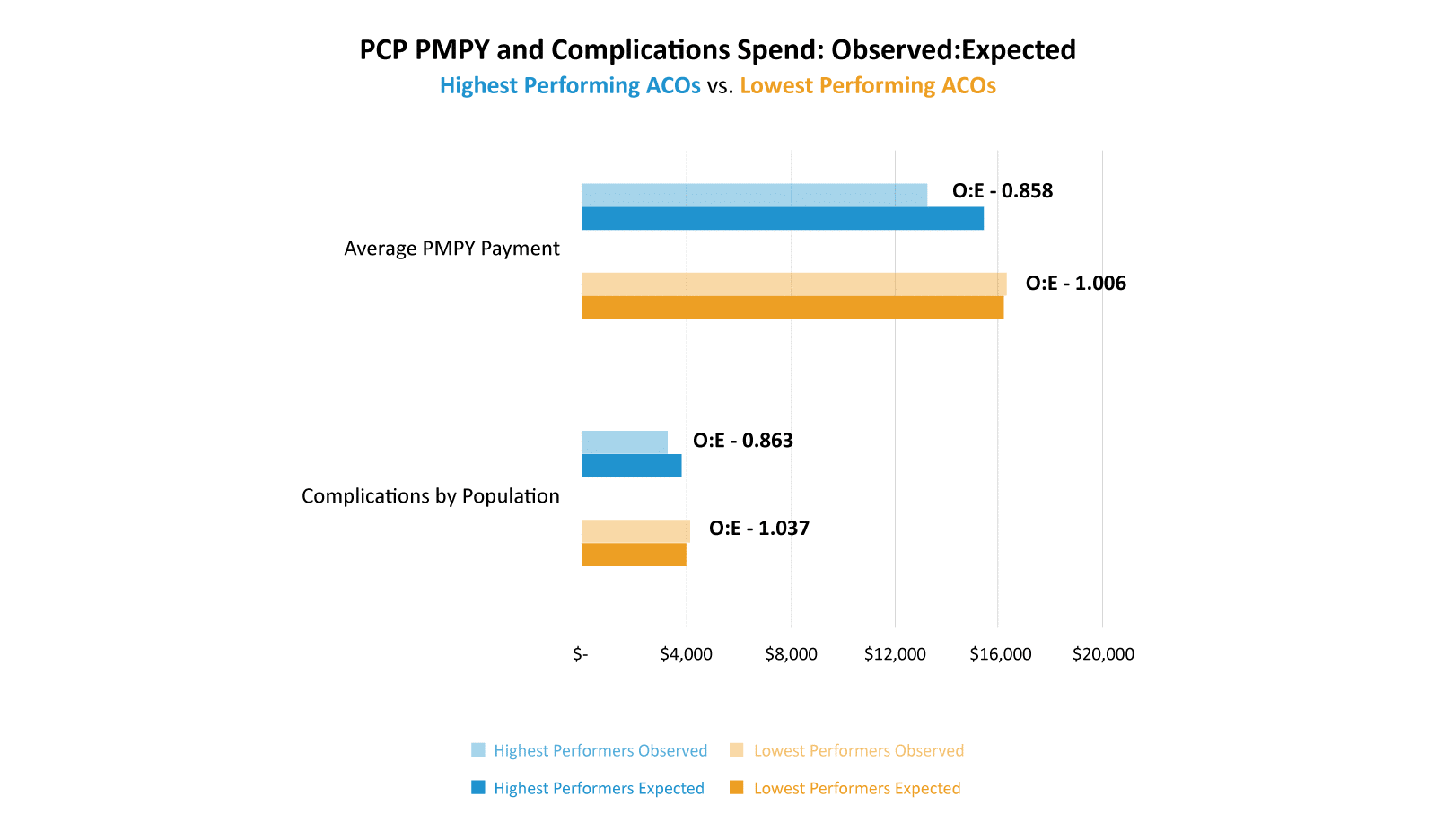
Takeaway: PCPs from Highest Performing ACOs have observed costs both in total cost of care and costs attributable to complications that are about 15% lower than their calculated expected costs. Conversely, PCPs in Lowest Performing ACOs had observed costs that exceeded expected amounts in both measures.
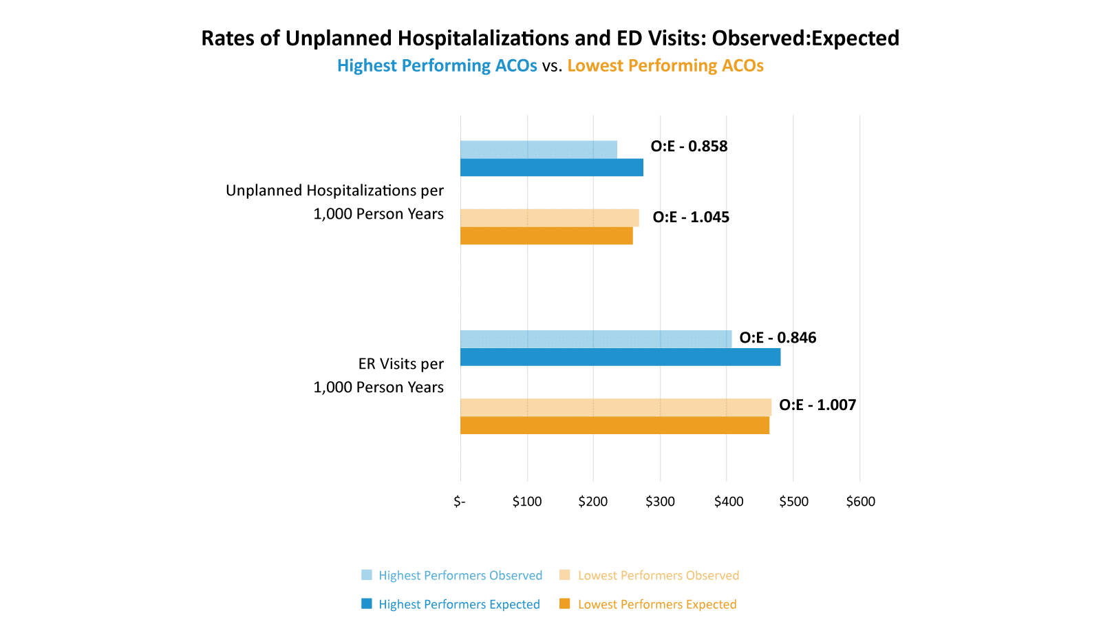
Takeaway: PCPs in Highest Performing ACOs had rates of ER visits and unplanned hospitalizations that were about 15% lower than expected. PCPs in Lowest Performing ACOs had higher rates than expected for both of these measures.
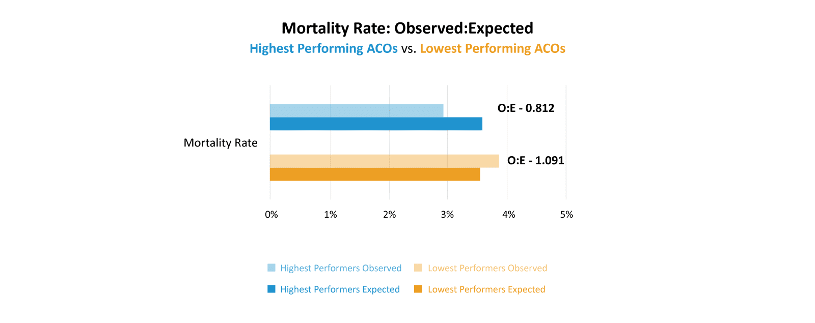
Takeaway: PCPs in Highest Performing ACOs had mortality rates that were about 19% lower than expected, whereas PCPs in Lowest Performing ACOs had slightly higher than expected mortality rates.
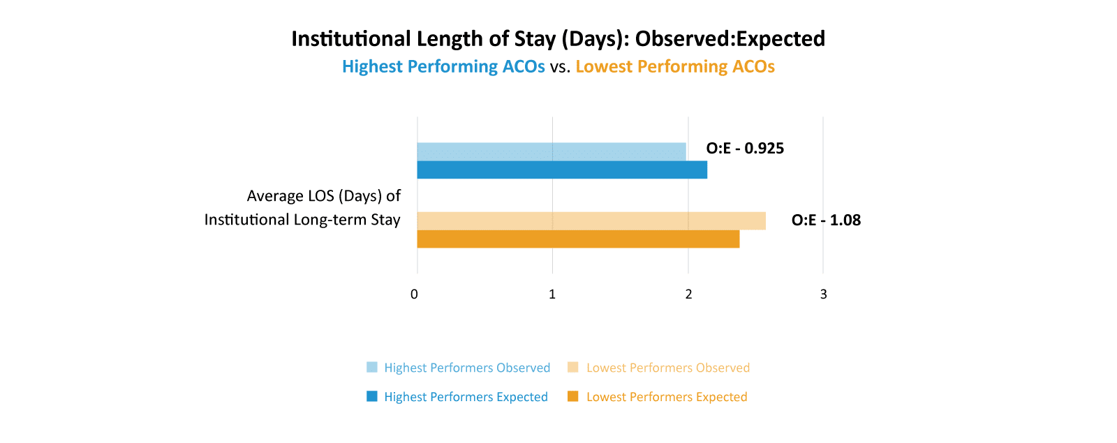
Takeaway: PCPs in Highest Performing ACOs had length of stays in institutions that were about 7% lower than expected. PCPs in Lowest Performing ACOs had longer lengths of stay than expected.
Tying the quality of primary care data pieces together, even though we don’t see many differences in the standard Value-based Care utilization metrics used to evaluate primary care services, we do conclusively see that PCPs participating in Highest Performing ACOs outperform PCPs participating in Lowest Performing ACOs along the six measures in CareJourney’s Provider Performance data, which encompass not only cost but quality measures as well. These PCPs are providing higher quality care at a lower cost.
Refine Post-Acute Routing
A value-based care organization’s strategy for post-acute care is not simply whether the patient is going to a cost-effective and high quality facility after an inpatient admission. Rather it is a two-step process to determine the appropriate post-acute care setting (SNF, LTAC, home health, or no post-acute care) followed by a second step of optimizing the specific post-acute care facility for cost and quality.
| Highest Performing ACOs | Lowest Performing ACOs | |
|---|---|---|
| SNF/1K | 63 | 72 |
| SNF PMPY | $732 | $1,161 |
| Home Health PMPY | $538 | $656 |
| Total PAC Spend | $1,270 | $1,818 |
| HH as % of Total | 42% | 36% |
With the 2022 ACO REACH cohorts we are studying, we see that the Highest Performing ACOs send their patients to skilled nursing facilities (SNFs) at a 14% lower rate than the Lowest Performing ACOs (63 to 72 discharges per 1K admissions). Summing the per beneficiary per year spend on SNF and home healthcare to create a “total post-acute care per beneficiary spend”, the Highest Performing ACOs spent a larger portion of post-acute care spend on home health (42%) than did the Lowest Performing ACOs (36%). CareJourney recently published a blog post linking timely access to home healthcare with better patient outcomes.
We can also look at readmission rates as a measure of post-acute care. As mentioned above, the Highest Performing ACOs and Lowest Performing ACOs each had a 14% readmission rate after an inpatient hospitalization. Similarly to how we used that measure as a marker of primary care, we can draw the conclusion that post-acute care in the Highest Performing ACOs is better than that for Lowest Performing ACOs. The Highest Performing ACOs would expect a higher readmission rate due to their ~20% sicker population, yet the readmission rate for this group is the same as the Lowest Performing ACOs.
Enhance Specialty Performance
The final driver of ACO success that we will analyze in this blog post is enhancing specialty performance. We will again utilize CareJourney Provider Performance data to evaluate specialist performance.
To analyze specialist performance within ACO REACH in 2022, we selected nine of the top condition-based episodes by overall cost and six procedure based episodes and compared CareJourney’s Provider Performance data for the two cohorts. In order to obtain the appropriate PPI data, we identified the beneficiaries aligned to the Highest Performing ACOs and the Lowest Performing ACOs in 2022 and then identified the practitioners that serviced the episodes those beneficiaries experienced. As with the primary care provider Provider Performance data above, the data shown below represents the average performance for the entire Medicare Fee For Service patient panel of each provider, and not strictly their performance within the episodes experienced by the ACOs aligned beneficiary population.
Similar to the Provider Performance data for primary care doctors, CareJourney’s Provider Performance data calculates an episode specific and risk adjusted expected value for a number of measures based on the individual provider’s patient panel, location, and a number of other risk adjustment variables. We then compare the provider’s observed costs or quality measures relative to the calculated expected value.
Specialist Performance for Condition Based Episodes
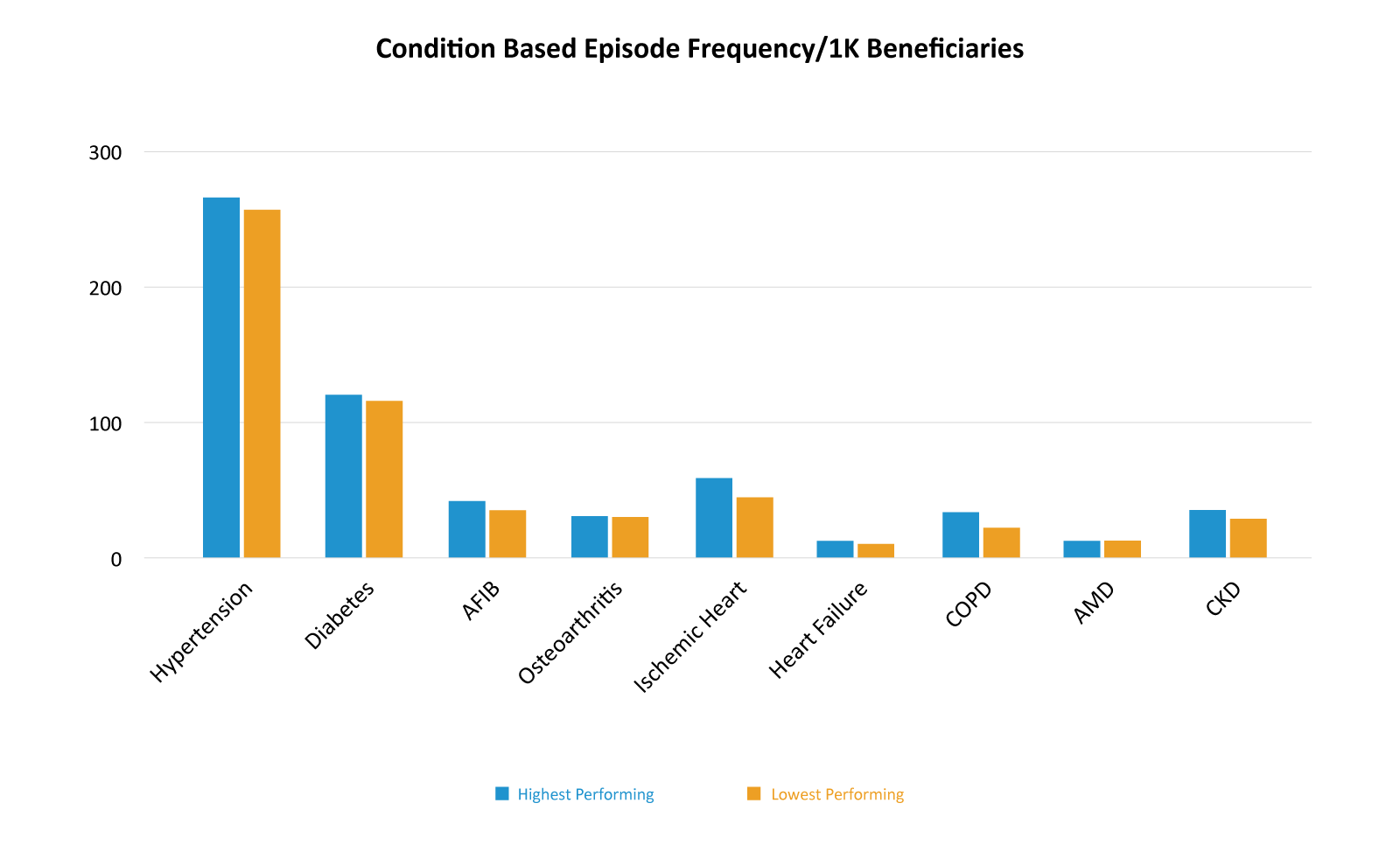
CareJourney’s condition-based episodes are year-long episodes that begin on January 1 the year after a patient receives a chronic condition diagnosis and run for the entire calendar year. The nine selected episodes are among the costliest episodes nationwide in healthcare. We learned above that the Highest Performing ACOs have an average risk score that is higher than that of the Lowest Performing ACOs. It is therefore not surprising that the Highest Performing ACOs have a slightly higher incidence of the Condition Based Episodes than the Lowest Performing ACOs.
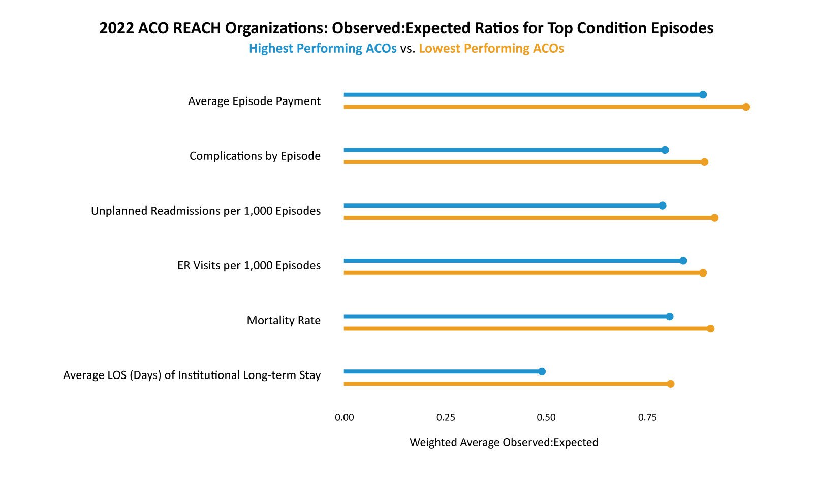
Turning to the Provider Performance cost and quality data, we rolled up the nine Condition Based Episodes via weighted average for the Highest Performers and the Lowest Performers creating a singular “9 Condition” observed to expected ratio for each of the Provider Performance measures.
You can see in the graph below that both the Highest Performers and the Lowest Performers had observed to expected ratios lower than one for each of the measures, meaning that the providers who serviced these episodes were all, on average, exceeding expectations. However, the Highest Performing ACOs had observed to expected ratios that were significantly lower than the Lowest Performing ACOs along each measure.
The Highest Performers had an observed average episode payment that was 88% of the expected amount whereas the Lowest Performers had an observed average episode payment that was 99% of the expected amount.
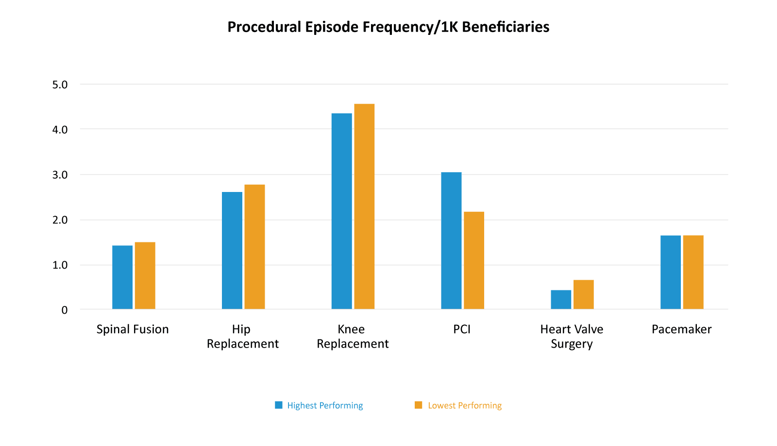
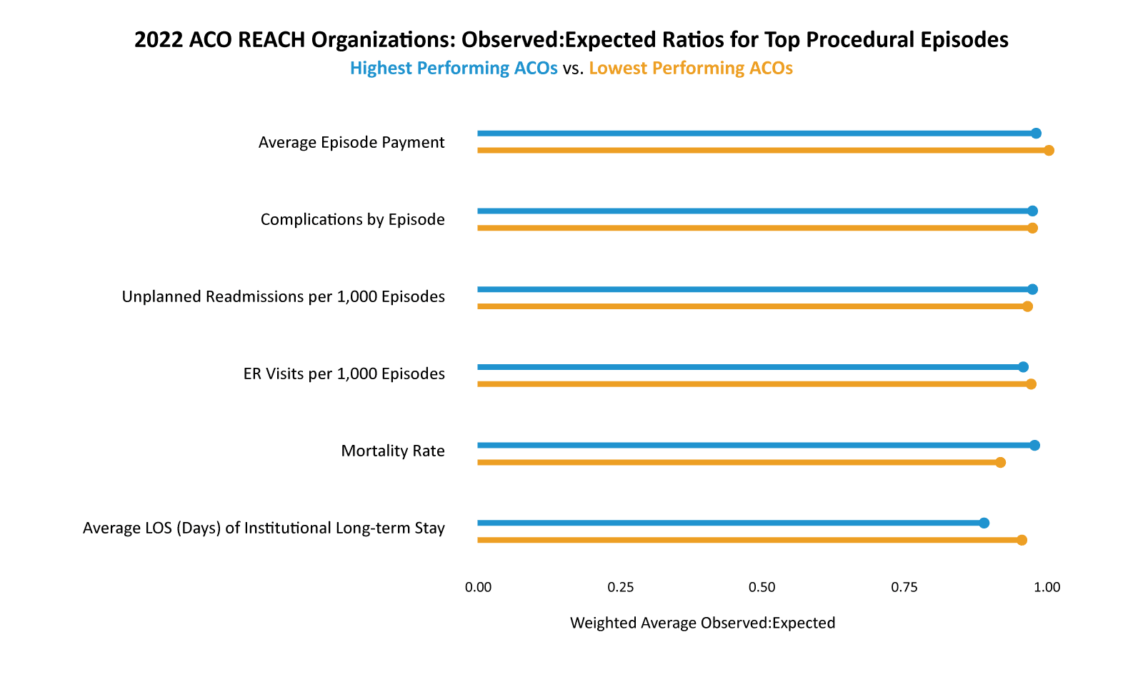
Turning to procedural episodes, we see an interesting change in episode frequency when compared to condition based episodes. With condition based episodes, the Highest Performing ACOs had a higher incidence than the Lowest Performing ACOs. With procedural episodes that trend is largely reversed with the Highest Performing ACOs having a lower rate of almost all six procedural episodes. Part of optimizing specialist performance is ensuring only necessary procedures are done. Are Highest Performing ACOs realizing savings by eliminating unnecessary procedures?
As with condition based episodes, both groups had observed to expected ratios that were one or below, meaning that on average the providers were efficient and higher quality than expected. Unlike condition based episodes, the Highest Performing ACOs did not have strikingly lower observed to expected ratios when compared to Lowest Performing ACOs for procedure based episodes.
Actionable Data for Improving Specialist Performance
The knowledge that a provider or set of providers is performing above or below a benchmark is useful in network curation. However, shifting referral patterns from a primary care provider to a specialist can be a difficult task. Beneficiaries also have a choice in which providers they see, so the reality of curating a specialist network is that sometimes ACOs have to work with the network of providers they have. CareJourney Provider Performance Data has drill-down levels that allow ACOs and providers to uncover specific and actionable data for improved performance both in quality and cost.
Heart Failure is one of the condition based episodes that we included in our study group. The Highest Performers had a weighted average episode cost of $4,039 and an average expected episode cost of $5,497 resulting in an observed to expected ratio of 0.73. The Lowest Performers had a weighted average episode cost of $5,670 with an average expected cost of $6,008 resulting in an observed to expected ratio of 0.94.
The first level of additional CareJourney Provider Performance data is cost breakout per episode. This cost breakout data shows the larger components of spend and then within each of the large components there are subcomponents. The chart below shows the overall episode cost breakdown for Highest Performing ACOs and Lowest Performing ACOs relative to their expected costs. The Highest Performing ACOs use Inpatient facilities and SNFs less than the Lowest Performing ACOs.
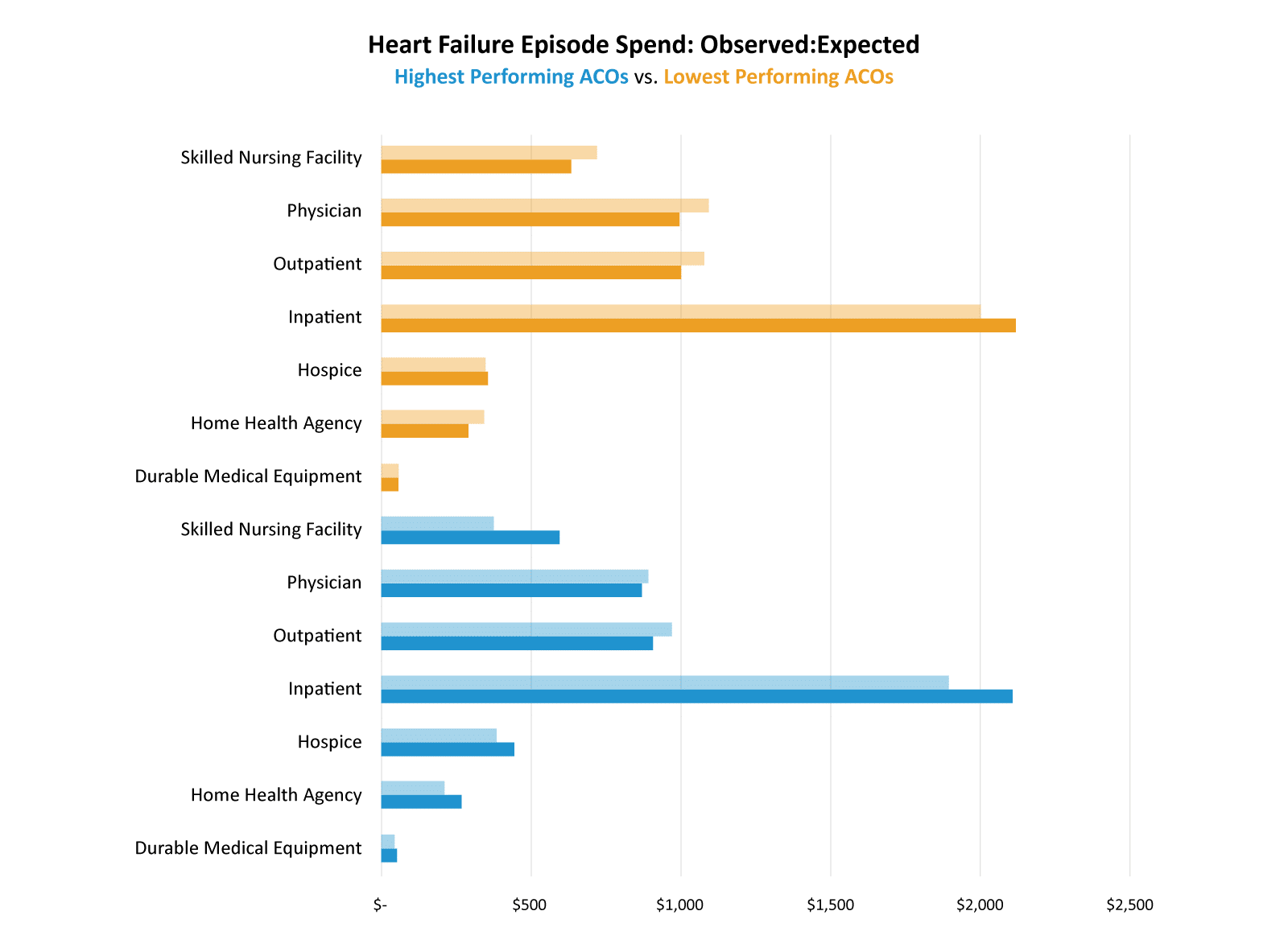
Takeaway: Highest Performing ACOs utilized inpatient facilities and SNFs less than expected.
This view also shows us that even the Highest Performing ACOs can improve their outpatient and physician spend. Both groups did a better than expected job with inpatient spend, but the Highest Performing ACOs saw greater savings than the Lowest Performing ACOs.
Thinking about inpatient utilization, one of the drivers of inpatient costs is unplanned readmissions. CareJourney Provider Performance data reveals that the Highest Performing ACOs have an observed to expected ratio of 0.9 for unplanned readmissions whereas the Lowest Performing ACOs have a slightly higher observed to expected ratio of 0.93. The top four causes of unplanned readmissions for these heart failure episodes are shown in the chart below.
| Average Per Episode Added Cost Due to Unplanned Readmission | ||||||
|---|---|---|---|---|---|---|
| Lowest Performing ACOs | Highest Performing ACOs | |||||
| Observed | Expected | OE | Observed | Expected | OE | |
| Acute Respiratory Failure | $208 | $224 | 0.929 | $166 | $199 | 0.835 |
| Acute Myocardial Infarction | $169 | $192 | 0.877 | $132 | $189 | 0.700 |
| Cardiac Arrhythmia | $137 | $133 | 1.028 | $127 | $154 | 0.824 |
| Percutaneous Coronary Intervention | $109 | $109 | 1.002 | $121 | $132 | 0.919 |
Takeaway: For each of these unplanned readmissions, Highest Performing ACOs had a lower than expected average additional cost as compared to Lowest Performing ACOs.
CareJourney Provider Performance can give providers insights like this into not only unplanned admissions, but also the specific complications and their associated costs for each episode and the causes of patient emergency department visits. Having this level of detail allows providers and ACOs to create action plans to improve not only costs but also patient outcomes and experiences.
Conclusion
CareJourney has identified a set of drivers of ACO success. When analyzing ACO REACH performance for 2022, it is clear that the Highest Performing ACOs excel in these drivers and the Lowest Performing ACOs struggle. Utilizing CareJourney Provider Performance Index data, ACOs can identify tangible actions for both primary care providers and specialists that will not only realize increased cost savings, but will provide higher quality care for their aligned beneficiary base.
How CareJourney Can Help Get You Started
A 10-year veteran in value-based care, CareJourney insights guide the strategies and operations of innovative healthcare organizations across the most impactful success drivers.
CareJourney insights help healthcare organizations grow, improve care quality, and reduce costs using the most robust, detailed, comprehensive claims dataset available.
Analytics derived from Medicare, Medicaid, Medicare Advantage and Commercial claims data unlock insights on over 300 million beneficiaries and 2 million providers. With open and transparent methodologies, CareJourney’s 250+ episodes benchmarked make both care decisions and business decisions a no-brainer.
- We excluded the High Needs ACOs due to their unique nature. The savings levers available to a High Needs ACO are different than those available to Standard and New Entrant REACH ACOs.
- Joynt KE, Figueroa JF, Beaulieu N, Wild RC, Orav EJ, Jha AK. Segmenting high-cost Medicare patients into potentially actionable cohorts. Healthc (Amst). 2017;5(1-2):62-67. doi:10.1016/j.hjdsi.2016.11.002
- Charlson ME, Pompei P, Ales KL, MacKenzie CR (1987). “A new method of classifying prognostic comorbidity in longitudinal studies: development and validation”. Journal of Chronic Diseases. 40 (5): 373–383. doi:10.1016/0021-9681(87)90171-8

