A Proposal to Enhance the Health Equity Benchmark Adjustment in ACO REACH
By Yubin Park, Erica Everhart, Kevin P. Buchan, Jr., Brandon Sim, Aneesh Chopra
September 16, 2022
In February 2022, the Centers for Medicare & Medicaid Services (CMS) announced ACO REACH, extending the Direct Contracting model to better align with CMS’ strategic initiatives. In this new model, CMS introduced many significant changes to achieve the goals, after which REACH is named – Realizing Equity, Access, and Community Health. Specifically, CMS implemented five design elements to promote health equity and address healthcare disparities for underserved communities.
This article will focus on the Health Equity Benchmark Adjustment (HEBA) policy among those five elements. The primary motivation for HEBA, as stated in the CMMI’s health equity webinar, is as follows: researchers have found that physicians in underserved communities are less likely to participate in ACO than others. Here, underserved communities refer to areas where a higher percentage of the population is 1) black, 2) living in poverty, 3) uninsured, 4) disabled, or 5) has less than high school education. Thus, as CMS states, HEBA aims to increase ACO participation of doctors in underserved areas.
In detail, HEBA works by adjusting benchmark rates for aligned beneficiaries in an ACO REACH, proposing the use of the Area Deprivation Index (ADI), which was developed by the Health Resources & Services Administration (HRSA) over three decades ago.1 HEBA combines a beneficiary’s ADI and Dual Medicaid Status to determine the adjustment amount. If the score is high, HEBA adds $30 per beneficiary per month (PBPM) to the benchmark; otherwise, it deducts $6 PBPM. Here, we strive to take a deeper look at the ADI measure.
Succeed in ACO REACH
Check out our library of case studies, blogs, and webinars to help you succeed in Performance Year 2023 and beyond.
What is ADI?
ADI is a measure designed to represent socioeconomic status in a region of interest. When it was published, ADI used 17 variables from U.S. Census data and applied Principal Component Analysis (PCA) to extract a single number that summarized those Census variables. The variables used in ADI include education level, employment status, home values, and income levels, and it has become a widely accepted measure of health equity. However, health equity is a multidimensional problem, and using PCA in computing the ADI score may cause some dimensions in ADI to be overweighted and dilute the importance of others.
ADI Over-emphasizes Home Values
ADI uses a statistical technique called PCA to derive a single number index. PCA is commonly employed in the domain of health equity research. For example, when Robert Graham Center developed the Social Deprivation Index (SDI), a related statistical technique called factor analysis was applied to a similar set of Census variables. However, there is an important distinction regarding the data used to design the two indices. SDI was constructed with only percent measures, while ADI used data with a mix of percent and dollar measures.
PCA is a powerful technique, but it is not without limitations. For example, when using variables with different units of measurement, PCA overweighs variables with larger numbers. Therefore, PCA often requires an additional data normalization step. This limitation is evident when considering income and home values compared to the other demographic variables used to construct the index. As opposed to percent-based demographic measures that range only from 0 to 100, home values naturally exist on a much larger scale that can reach from 0 to millions of dollars. The original paper introducing ADI does not specify that the data were normalized. Furthermore, a peer-reviewed research paper to replicate ADI in Utah shows a significantly large coefficient for the home value variable compared to the other variables in ADI. Based on this simple intuition, supported by our exploratory data analysis presented in the next section, we believe that ADI over-emphasizes home values. More importantly, we review four examples demonstrating why integrating ADI in the current proposed fashion may conflict with HEBA’s intent to promote health equity.
Example 1: ADI Does Not Correlate With Other SDoH Indices
For decades, many researchers worldwide have tried to measure social deprivation using census data and use such a measure to influence healthcare policies. For example, New Zealand and the United Kingdom developed their own indices to adjust clinical funding and allocate community resources. In the US, outside of ADI, two Social Determinants of Health (SDoH) measures are well studied and utilized: Social Vulnerability Index (SVI) by the Centers for Disease Control and Prevention and Social Deprivation Index (SDI) by Robert Graham Center.
Figure 12 shows county-level indices of ADI, SDI, and SVI. As discussed earlier, SDI used a factor analysis using only percent measures, and SVI averages various percentile measures. Therefore, both SDI and SVI are not affected by different measurement units. As can be seen, the patterns between SDI and SVI resemble. However, the ADI map is distinct from the other two popular indices. For example, ADI categorizes all California counties as the top 50 percentile, while SVI and SDI show county-level variations within the state.
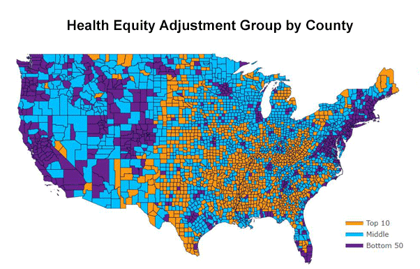
Area Deprivation Index (ADI)
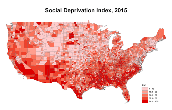
Social Deprivation Index (SDI)
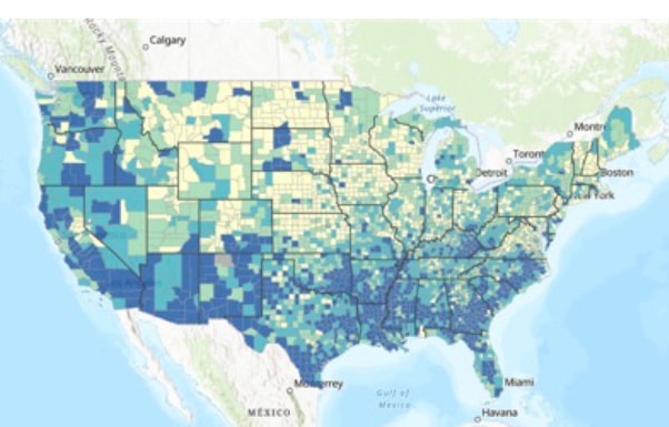
Social Vulnerability Index (SVI)
Figure 1 The entire California states are within the top 50 percentiles according to ADI, while SDI and SVI view some California states are disadvantaged.
Another important measure of SDoH is a member’s Medicaid eligibility. This indicator differs from the census-derived measures, as the eligibility looks at individual-level data rather than geographic aggregate data. Figure 23 illustrates the county-level relationship between the rates of Medicaid eligibility and ADI. Ivy Dong et al., a senior consulting actuary at Wakely Consulting Group, said, “we observed a weak correlation between dual eligible status and the ADI ranking. Fifty percent of the total Medicare beneficiary population resides in the bottom 5-decile counties.” We suspect that the vulnerable population in big metros does not get captured in ADI since those metros tend to have higher house values than rural areas.
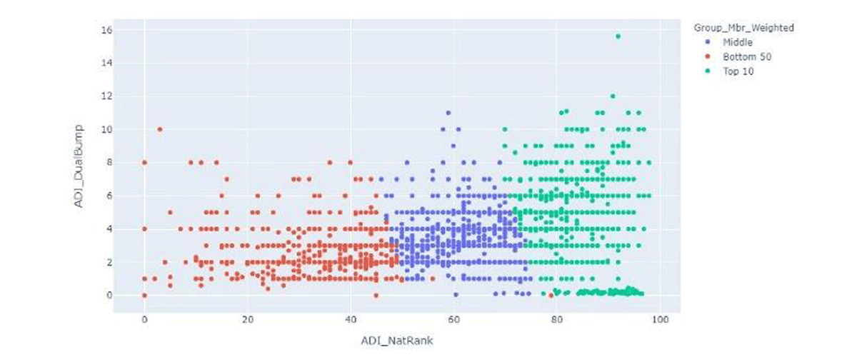
Figure 2 ADI and Medicaid eligibility are weakly correlated.
Example 2: Home Values May Not Represent Poverty Rates in Los Angeles Market
Figure 3 shows an image from the ADI website on the left and an image from the U.S. Census Bureau on the right. Both images depict information about the city of Los Angeles, California. The blue regions contained in the ADI image show low deprivation throughout Los Angeles using the ADI national scale. According to ADI, most people in Los Angeles are not highly deprived, which is influenced by the fact that home values in Los Angeles are among the highest in the United States. However, the blue regions in the U.S. Census Bureau image reveal numerous high-poverty areas, which ADI in Los Angeles does not represent well.
This pattern is not limited to the Los Angeles area. National-level ADI will be susceptible to differences in real-estate values across states. For example, beneficiaries in coastal cities like New York, San Francisco, and Los Angeles rarely get high ADI scores.
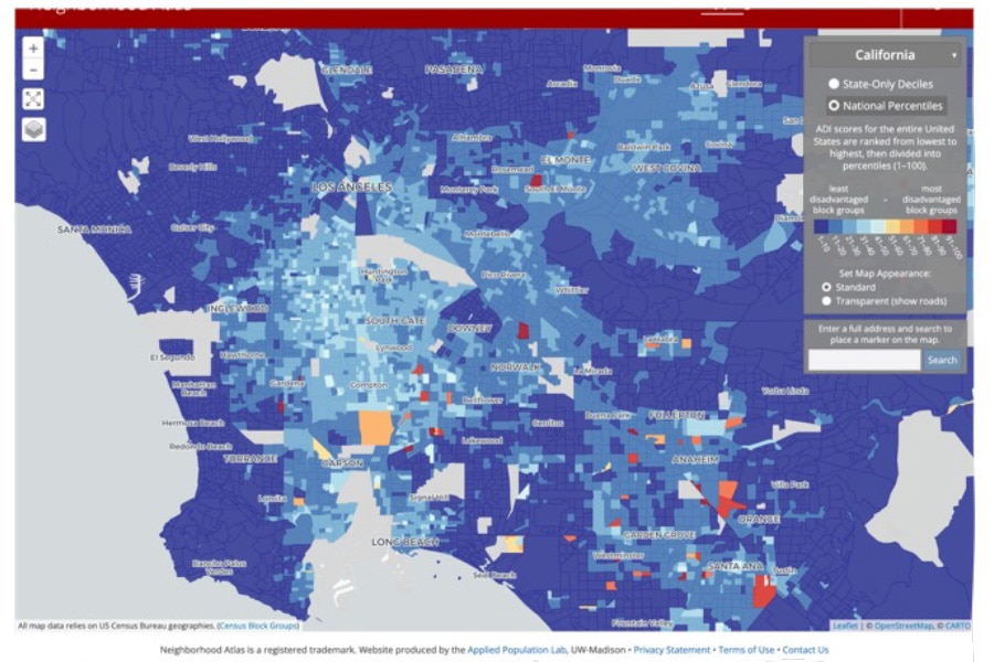
ADI Map
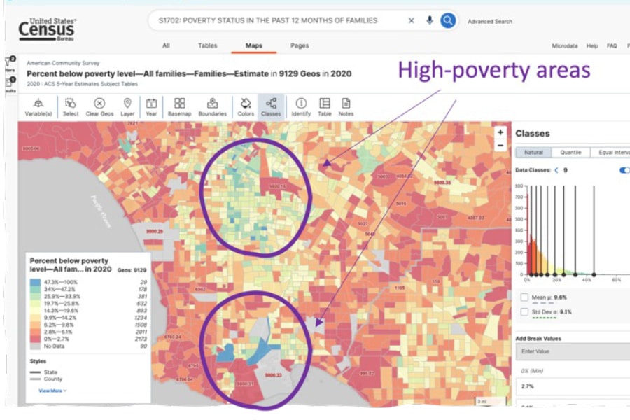
Census Data
Figure 3 ADI doesn’t label LA’s high poverty rate areas as disadvantaged. Blue-colored regions are in the bottom 50% of ADI (i.e., not disadvantaged) on the left map. However, the Census data on the right shows some parts of Los Angeles have high poverty rates, colored in blue.
Example 3: Government-controlled Housing Receive Preferential Treatment in New York Market
Figure 4 illustrates national-level ADI scores in Manhattan, NY. High deprivation areas—indicated by the colors red, orange, and yellow—are sparse in the figure, as most Manhattan homes are expensive. Interestingly, while not all census block groups with affordable housing are high-ADI areas, every high-ADI area contains “affordable housing.” This is a classic example of the “modifiable areal unit problem” – some Census Block Groups exactly cover affordable housing areas, while other Block Groups contain a mix of both affordable and regular housing, raising the ADI in those Block Groups and lowering ADI. This can lead to the odd phenomenon in which a beneficiary living in affordable housing may be designated as living in a low-ADI area simply based on the density of high-cost homes in her vicinity. Furthermore, as not all beneficiaries who qualify are able to secure affordable housing, an ADI-based approach will misclassify those not yet living in affordable housing as living in areas of low deprivation, even though they meet the requirements.
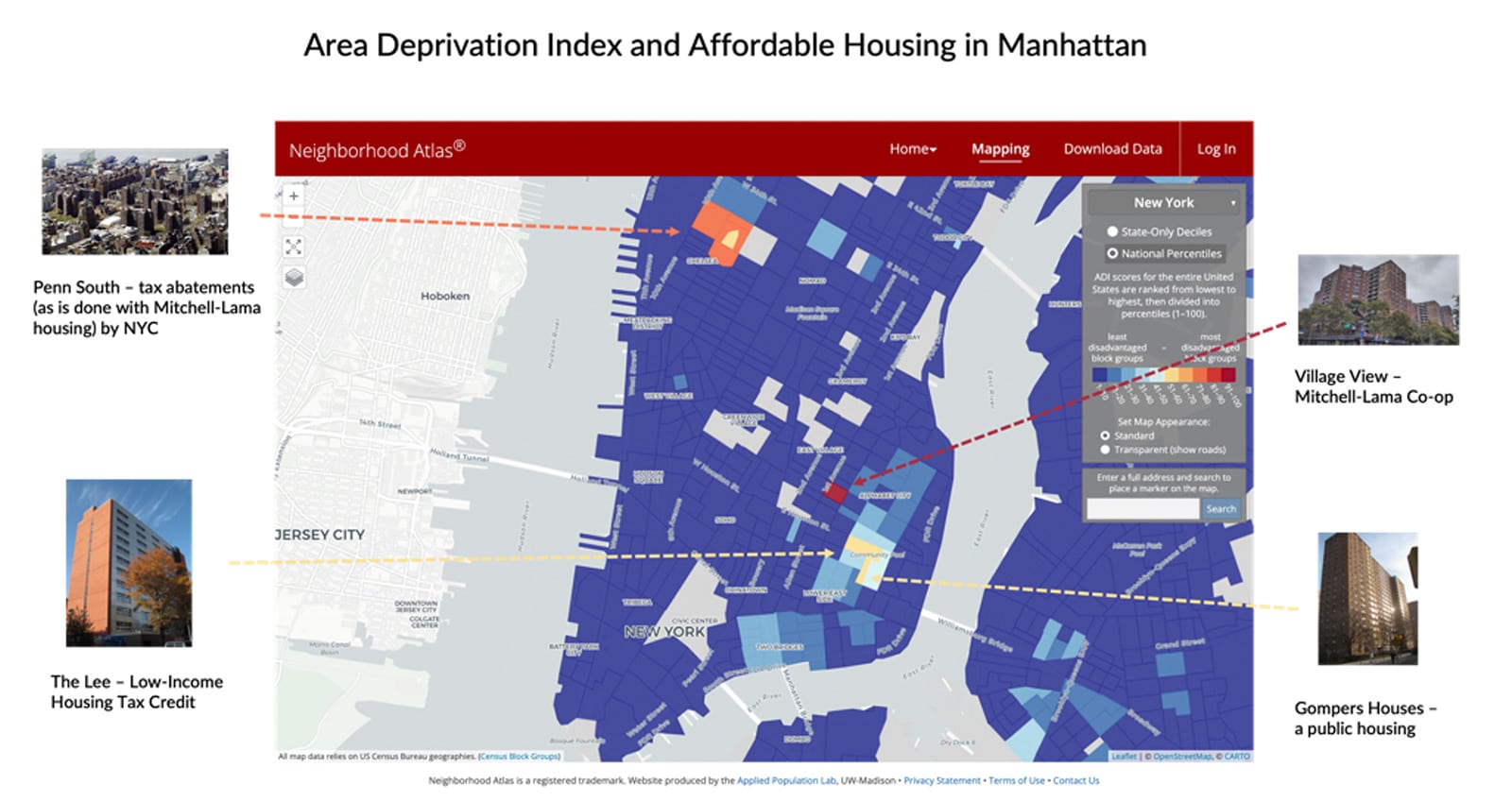
Figure 4 High-ADI Census Block Groups contain affordable housing. However, not all eligible beneficiaries are selected to live in affordable housing.
Example 4: A Tale of Two Counties
Delving deeper into the construction of the ADI, we queried the Census API for the American Community Survey variables utilized in the Area Deprivation Index (as outlined in a paper that calculates Utah-specific ADI scores based upon the methodology utilized in the original paper introducing the ADI) and compared the results for two counties: Los Angeles County in California and Okaloosa County in Florida. Los Angeles County is an ocean-front county in California with over ten million people residing there. Okaloosa County is also an ocean-front county, but in Florida, and is home to just over 200,000 people. We chose Okaloosa County, in part, because like Los Angeles County it is home to beautiful beach-front homes that have a relatively high value compared to other areas in the county which have much lower value homes.
Los Angeles County is approximately 75% comprised of non-White individuals (as defined by subtracting individuals who identified as being of only one race, with that race being White from the total population) whereas Okaloosa County is approximately 30% non-White individuals. Looking solely at the Medicare Fee For Service (FFS) population, Los Angeles County is about 50% non-White and Okaloosa County is 13% non-White.
What we found is that aside from the variables relating to housing, Los Angeles County and Okaloosa County look very similar. However the variables relating to housing result in a substantially different raw ADI score, which translates into very different National ADI scores for the Census block groups in those counties. In the areas where there are differences, such as income disparity, percent of population below the poverty level, percent of population below 150% of the poverty level, percent of population without transportation, and population with less than a 9th grade education, those variables are actually correlated with a higher ADI score further illustrating how strongly housing values negate otherwise highly distressed areas in the ADI scoring process. Removing the housing-related variables from the calculation results in very close scores for these two counties.
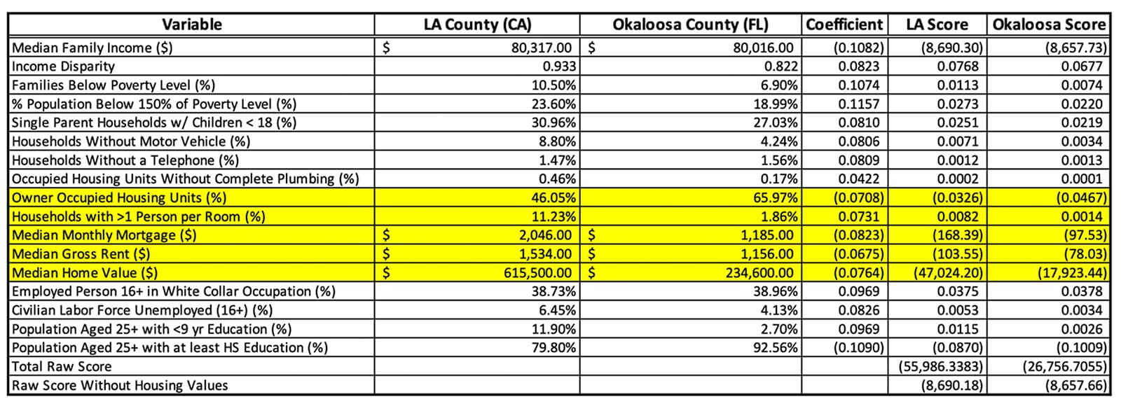
Figure 5 Census Variables Comprising ADI Score for LA County and Okaloosa County.
The heatmaps for ADI generated by the Neighborhood Atlas website show ADI scores at the granularity in which they were calculated – the Census block group. Aggregating to county level as we did above certainly introduces inaccuracies, but was necessary given the space constraints of this article. Looking at the images below, however, it is clear that finding ADI scores high enough to earn the thirty dollars per beneficiary per month HEBA in Los Angeles County is almost, if not actually, impossible. Even adding twenty-five points to the scores for dual-eligible beneficiaries is unlikely to bump a beneficiary into that top (10th) decile. Contrast these ADI scores with the map of Okaloosa County and it is easier to find Census block groups with ADI scores high enough to merit the HEBA.
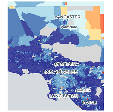
Figure 6 ADI Map of Los Angeles County
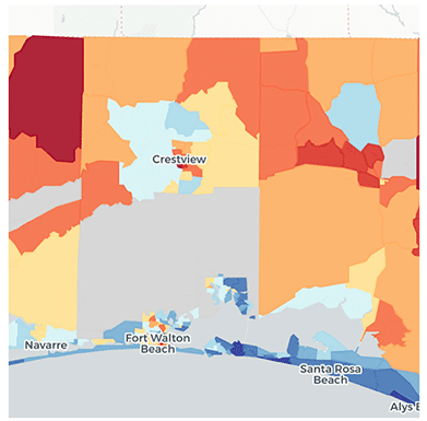
Figure 7 ADI Map of Okaloosa County
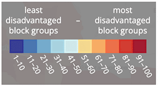
The addition of the HEBA is aimed at incentivizing ACOs to serve the underserved beneficiaries within their community. This incentive is also a steppingstone towards achieving the goal outlined by CMS of having one hundred percent of Medicare beneficiaries in a value-based care arrangement by 2030. The “housing-value glitch” in the ADI works squarely against both aims. A vast majority of underserved beneficiaries live in big cities, which tend to have higher housing values. Bringing the greatest number of underserved beneficiaries into value-based care arrangements requires aligning the methodology used by CMS to identify the groups of beneficiaries for whom providers receive incentives for outreach to join their ACO with the locations housing the highest numbers of underserved beneficiaries.
Again, comparing Los Angeles County and Okaloosa County, there is a stark difference in the counts of beneficiaries in underserved populations who remain outside of value-based care, with Los Angeles County having approximately 100 times more underserved beneficiaries that are not yet in value-based care arrangements than Okaloosa County.

Figure 8 Underserved Beneficiary Comparison – LA County and Okaloosa County. Data sourced from CareJourney.
Extrapolating to a national level, the greatest numbers of both non-White Medicare FFS beneficiaries and dual-eligible beneficiaries are in large cities, as evidenced by the heatmaps of the United States below. We are certainly not advocating for CMS to focus solely on populous cities, however if CMS is going to realize their goals of getting all Medicare beneficiaries into value-based care arrangements by 2030, a successful strategy requires the creation of proper incentives for providers and for beneficiaries to enter into these arrangements. ADI scores as a component of the HEBA fail to properly incentivize providers in areas with high housing costs, which are mostly populous cities, and areas with high housing costs are exactly where large numbers of underserved beneficiaries exist outside of value-based care arrangements.

Figure 9 Locations of Non-White, Dual Eligible, and ACO Enrolled Beneficiaries, 2021. All data sourced from CareJourney.
Possible Enhancements to HEBA
CMS introduced HEBA to increase ACO enrollment of underserved populations, either by attracting more doctors in underserved areas, or incentivizing networks to grow in underserved markets. However, the ADI-based adjustment method is unlikely to achieve its intended purpose in these areas. ADI, which applies PCA to data with multiple units of measurement, disproportionately overweighs home values relative to other important demographic variables. Underserved areas are not represented solely by home values but also by race, education, disability, and poverty rates. Furthermore, home values may mislead due to the disparities across states and areas with significant price differences and the presence of government-controlled or subsidized housing.
To better align HEBA with its intended purpose, we urge CMS to prioritize:
- Dual Status. The current HEBA implementation adds 25 points if a beneficiary is dual-eligible. Dual eligible beneficiaries are highly deprived, as they meet special needs requirements to qualify for Medicaid. Dual status is a reliable health equity proxy, as—unlike ADI—it is not limited by the availability and currency of Census data, nor is it limited by the estimation error introduced by PCA. Furthermore, emphasizing the Dual Status would better align HEBA with the newly proposed Advance Investment Payments, where duals get 100 points to start.
- State-level ADI. ADI comes in two versions: national and state levels. The state-level ADI is normalized to mitigate issues caused by national variation, such as the differences in home values state-by-state.
- Challenge.gov. To spur creativity in the medium to longer term, CMS could issue a national challenge to better identify low-burden measures that more accurately capture SDOH risk, just as it had done to spur novel AI-based applications to better identify avoidable hospitalization events via the AI Health Outcomes challenge.
We proposed the former two ideas as minimal enhancements that build on the original policy framework, acknowledging HEBA’s purpose as novel and timely. We, however, believe designing an incentive mechanism around health equity is a complex, multidimensional task that requires a comprehensive and thoughtful solution.
To that end, we proposed the latter Challenge.gov approach to tap the expertise of the American people to surface better solutions that minimize gaming or provider burden through the proper use of technologies and data. For example, researchers at the Mayo Clinic developed an individual-level SDoH index, HOUSES, that estimates risk by modeling a modest set of publicly available data filed across all local governments at the individual housing unit level. Such individual measures can potentially overcome the limitations of aggregate measures (ADI, SVI, and SDI), such as ecological fallacy. We believe an innovative solution would require an open and collaborative effort between the private and public sectors. Achieving health equity will be the decade’s problem, and the existing collaborative platform would be the prime testing ground for the challenge.
Participating in the ACO REACH Model?
Learn how to be successful in the model.
Part of the Medicare Shared Savings Program (MSSP)?
Learn how to improve performance in MSSP.
Author Biographies
Yubin Park, Ph.D., is Chief Analytics Officer at Apollo Medical Holdings, Inc. (ApolloMed, NASDAQ: AMEH). He oversees value-based care analytics, remote patient monitoring, and partnerships with third-party data vendors in his current position. Yubin started his career by founding a healthcare analytics start-up after obtaining his Ph.D. degree in Machine Learning at the University of Texas at Austin in 2014. His first start-up, Accordion Health, provided an AI-driven Risk Adjustment and Quality analytics platform to Medicare Advantage plans. In 2017, Evolent Health (NYSE: EVH) acquired his company, and there, he led various clinical transformation/innovation projects. In 2020, he then founded his second start-up, Orma Health. The company built a virtual care and analytics platform for payers and providers in value-based care, e.g., Direct Contracting Entities and Accountable Care Organizations. At Orma, he worked with many sizes of risk-bearing primary care and specialty groups, helping them connect with patients through virtual care technologies. ApolloMed acquired Orma Health in 2022.
Erica Everhart, J.D. is colloquially known as the APM Queen at CareJourney where she focuses on utilizing data to examine health care policy issues as well as CareJourney’s strategy around Alternative Payment Models. She has a B.S. in microbiology from MIT and a J.D. from George Mason University School of Law. Prior to joining CareJourney, Ms. Everhart had careers in both software engineering and the private practice of law representing many physicians as they transitioned into value-based care models.
Kevin Buchan Jr., Ph.D. is Director of Analytics at ApolloMed. He received a Ph.D. in Information Science, Summa Cum Laude, from the State University of New York at Albany in 2021. His dissertation was titled, “Using Machine Learning to Predict Super-Utilizers of Healthcare Services.” He received a Master of Science in Technical Communication, Summa Cum Laude, from Rensselaer Polytechnic Institute in 2011. Prior to joining ApolloMed, Dr. Buchan was a Principal Data Scientist at Nascate, Inc. for over four years, and a Software Engineer at IBM for nearly 3 years.
Brandon Sim is the Co-Chief Executive Officer at ApolloMed, where he is responsible for the company’s overall strategy, end-to-end service delivery, non-clinical operations, and all technology aspects of ApolloMed’s business, including engineering, IT, data science, and more. Since joining ApolloMed in 2019, he has also served as COO, CTO, and VP of Engineering. Mr. Sim received both his M.S. in computer science and engineering and B.A. in statistics and physics, magna cum laude with high honors, from Harvard University.
Aneesh Chopra is the President of CareJourney, an open data and analytics platform delivering a trusted, transparent rating system for physicians, networks, facilities and markets on the move to value. He served as the first U.S. CTO and authored “Innovative State: How New Technologies Can Transform Government.” He serves on the Boards of the Health Care Cost Institute, Virginia Center for Health Innovation, IntegraConnect, Upstream Care, International Digital Accountability Council, and Chairs the George Mason Innovation Advisory Council. He earned his MPP from Harvard Kennedy School and BA from The Johns Hopkins University.
Disclosures
The authors are executives and employees at Apollo Medical Holdings, Inc. which operates a Direct Contracting Entity in the California market.
- Note: CMS has stated that it may explore other variables before the program starts.
- The ADI image source: https://www.wakely.com/sites/default/files/files/content/health-equity-adjustment-under-aco-reach-program.pdf SVI: https://svi.cdc.gov/map.html
- Image source: https://www.wakely.com/sites/default/files/files/content/health-equity-adjustment-under-aco-reach-program.pdf
References
-
- https://www.healthaffairs.org/doi/10.1377/hlthaff.2015.1635
- https://innovation.cms.gov/innovation-models/aco-reach
- https://innovation.cms.gov/media/document/aco-reach-health-equity-slides
- https://innovation.cms.gov/strategic-direction-whitepaper
- https://royalsocietypublishing.org/doi/10.1098/rsta.2015.0202
- https://www.graham-center.org/maps-data-tools/social-deprivation-index.html
- https://www.neighborhoodatlas.medicine.wisc.edu/
- https://data.census.gov/cedsci/map?q=S1702%3A POVERTY STATUS IN THE PAST 12 MONTHS OF FAMILIES&g=0400000US06%241400000&tid=ACSST5Y2020.S1702&cid=S1702_C02_001E&layer=VT_2020_140_00_PY_D1&palette=Spectral&breaks=Natural%289%29&mode=thematic&loc=33.8950,-118.2312,z9.9331
- https://www.wakely.com/sites/default/files/files/content/health-equity-adjustment-under-aco-reach-program.pdf
- https://www.graham-center.org/maps-data-tools/social-deprivation-index.html
- https://www.healthaffairs.org/doi/10.1377/hlthaff.2016.0709
- https://academic.oup.com/jamia/article/29/7/1142/6565895?login=true
- https://www.ncbi.nlm.nih.gov/pmc/articles/PMC5019337/
