
By Charlotte Jackson
Among people whose job it is to mine healthcare data for insights on population health and quality of care, there can be a tendency to assume that insights generated from one source of data (e.g., traditional Medicare) will naturally prove to hold true when applied globally to all patients and providers. After all, if there’s one thing clinicians hate, it’s being asked to treat patients differently based on the type of insurance they have. But be aware – even though the patient’s insurance may be the last thing on a provider’s mind when deciding on a treatment plan, when trying to accurately measure performance, it can have surprising downstream impacts that you may not expect.
Are you judging the quality of your provider group, facility, or network with data from just a single source or line of business? Are you using data from multiple sources or lines of business, but analyzing it all the same way? Using the 2015 Encounters data for all beneficiaries in both Medicare Advantage and Traditional Medicare, CareJourney has analyzed primary care practices that appear in each dataset. The results may challenge your assumptions.
Build and Optimize Networks of Care with Network Advantage
REQUEST A DEMO- The population in one line of business could be unexpectedly riskier….
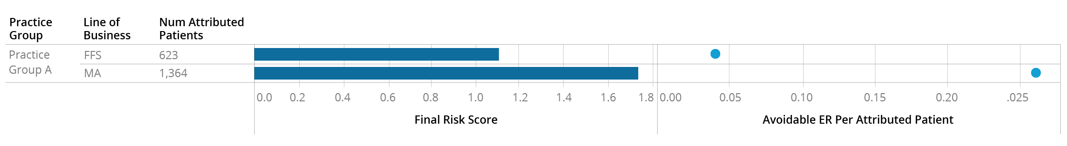
The Traditional Medicare beneficiaries attributed to Practice Group A appear to be somewhat riskier than the national average, with a combined risk score of 1.11. But it appears that their Medicare Advantage attributed patients – which make up 2/3 of their panel – are significantly riskier, with an average score of nearly 1.8. As you might expect with such a different risk profile, these two patient populations also behave differently, with the Medicare Advantage patients making over 5x the “avoidable”[1] visits to the ER. Looking only at the FFS data for this practice would have completely mischaracterized the types of patients they care for.
- …or payer actions could cause the population risk levels to appear different, when they really aren’t
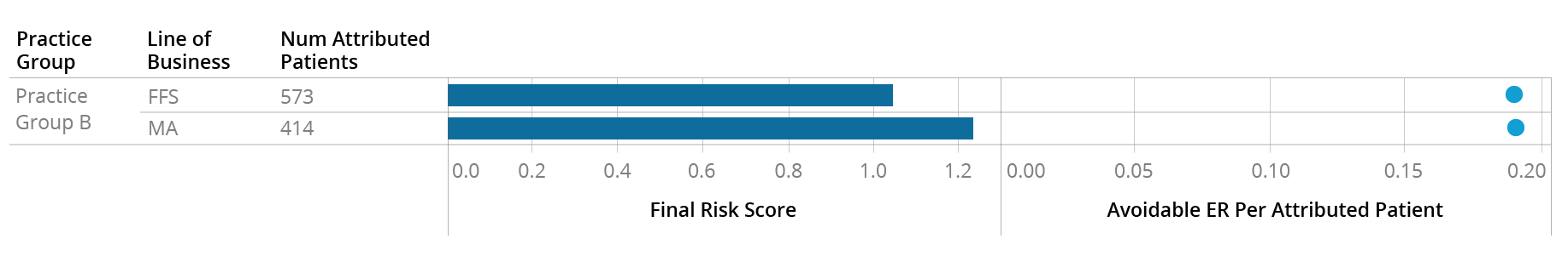
At first glance, Practice Group B appears to have a similar patient risk profile to Practice Group A, with attributed Traditional Medicare patients having a risk score in line with the national average and Medicare Advantage patients being riskier with an average score of 1.25. However, unlike at Practice A, these two patient groups appear to have exactly the same rate of Avoidable ER utilization:
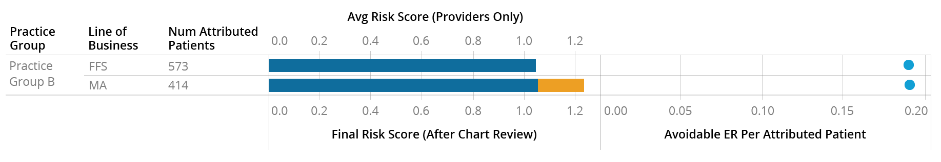
In this particular instance, the provider (blue) appears to be coding the two groups of patients similarly – which makes sense, as they appear to behave similarly, at least based on the Avoidable ER metric. The difference in the risk score (orange) is coming from additional codes submitted by payers after pulling and reviewing these patients’ charts:
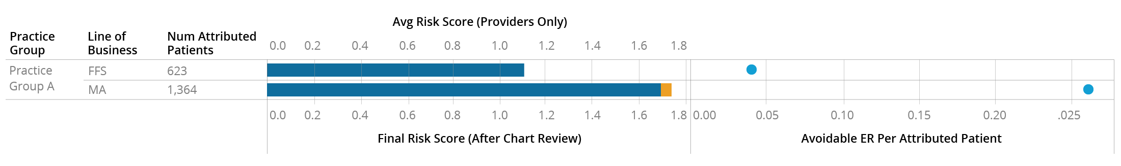
This is in contrast to Practice A, who appears to be coding the two sets of patients differently to begin with:
It’s important to note here that there is no reason to believe the provider-submitted risk score is more accurate than the payer-submitted one. Both the MA and FFS populations of Practice B have an Avoidable ER rate similar to the higher-risk MA population of Practice A, so it’s possible that Practice B is not coding either population of patients as accurately as they could be. Regardless of whether these patients are more accurately described by the higher or lower average risk score, it’s clear that they are similar populations and the provider is treating them similarly, but this isn’t immediately apparent from surface-level data.
- Payer preferences may not dictate care, but they can influence how care is reported
Annual wellness visits are tracked with a specific HCPCS code that can affect reimbursement, so providers who see Medicare patients on a fee-for-service basis are incentivized to report this code whenever applicable. However, providers who see Medicare Advantage patients may or may not be incentivized by the payer to report this code, regardless of whether they are bringing patients in for an annual visit. The AWV Compliance Rate metric therefore can look very different within the same practice for different LOBs, and the rates don’t differ in any predictable direction:
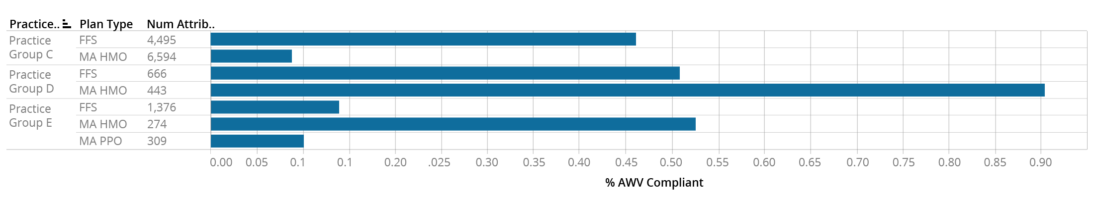
This table shows the AWV Compliance Rates for the MA and FFS patients attributed to practice groups C, D, and E. Practice C has a much higher AWV rate for their FFS panel than their MA HMO panel, Practice D shows the opposite pattern, and Practice E shows a low rate for FFS and MA PPO patients, but a high rate for MA HMO patients. Rolling up the AWV Compliance rate to the practice group level would obscure this information and lead to potentially misleading conclusions.
- Even within a practice, providers will work with different payers
Providers within a practice don’t all behave the same way, and this extends to which payers they have relationships or contracts with. For instance, Practice Group F has 36 affiliated physicians, all of whom see FFS patients. However, only 16 of them see MA patients from Payer 1, and only three of them see MA patients from Payer 2:
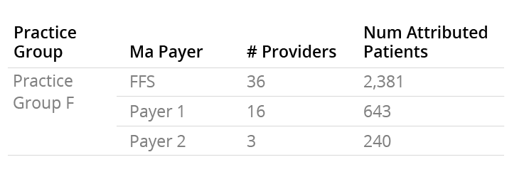
If you as a payer want to begin a relationship with this practice group, you have to be aware that you may not be getting access to as many patients, or to as many providers, as what you would assume based on the FFS Medicare data.
- Some practices will only appear in one data source
As Medicare Advantage has become increasingly popular with beneficiaries, some physician groups have decided to commit fully to the MA model and withdraw from treating FFS Medicare patients altogether. For example, in the Miami area alone, looking only at FFS Medicare data would mean completely missing over 150 practice groups with over 50,000 attributed patients.
There are many more differences between the FFS and MA population than what we’ve outlined above. If you’re curious about what additional insights CareJourney can offer in the MA Encounters data, reach out to sales@carejourney.com or request a demo below.
Build and Optimize Networks of Care with Network Advantage
REQUEST A DEMO
[1] As measured by the NYU algorithm for identifying non-emergent, preventable, and PCP-treatable ER visits